01
Context & my role
Diamonds VPN ran as a Telegram Mini App and was paid for in crypto (TON). I know the founder; we planned a redesign together, it kept getting postponed, and then the product closed. The original site is offline, and a Figma capture of its homepage is all that remains. I did not design the original.
I wrote the structure, copy and motion direction and reviewed every iteration in the browser. The code was written with Claude as an AI pair; my job was to decide what to build, judge each version and push it until it worked.
02
Problem
The original homepage looked impressive but explained very little. I reviewed it as a first-time visitor with four questions: what is it, can I trust it, how much is it, how do I start. It answered none of them well.
| # | Issue | Severity |
|---|---|---|
| 1 | No navigation: no links to pricing, apps, help or log in | High |
| 2 | The hero (“Your privacy shielded”) fits any VPN; nothing says Telegram or crypto | High |
| 3 | “Flexible pricing” is promised, but no prices appear anywhere | High |
| 4 | Platform icons have no names; Telegram, the main platform, is missing | Medium |
| 5 | Crypto payment, the strongest differentiator, is buried in small card text | Medium |
| 6 | The same paragraph appears twice; feature tiles repeat the grid | Medium |
| 7 | The FAQ has no buying questions (price, how to pay) | Low |
For a VPN this matters twice: people won’t pay for a product they don’t understand, and they won’t trust a privacy product that looks vague. The brand also needed to feel premium. A dark page with a stock globe didn’t do that.
03
Process
Audit
Pinned the issues above on the captured homepage and ranked them by how much they block a first purchase.
First direction in Figma
Four pages (Home, Pricing, Apps, Help), a 17-colour variable set, 11 text styles and a small UI kit. The structure worked. The look didn’t: it was clean but generic, and could have been any VPN template. I dropped the visual direction and kept the structure and copy.
New reference
I chose a dark, particle-based style: oversized type, glass cards, data shown as dots. I adapted it to the Diamonds brand: night blue, electric blue, cyan and the diamond itself.
Live site instead of mockups
The idea depended on motion and interaction, which static frames can’t show. I built it in the browser with Three.js and GSAP, working with Claude as an AI pair, and reviewed each version on desktop and mobile.
Iterations
Six rounds of review. The biggest changes: a larger centred globe; no dark scrim behind the hero text; and a particle layer that carries the hero’s look through the rest of the page.
04
Key decisions
1 Tell the brand story in the first six seconds
- Decided
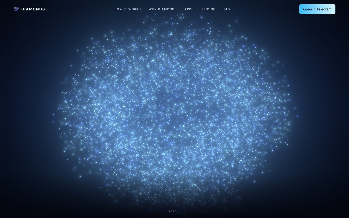
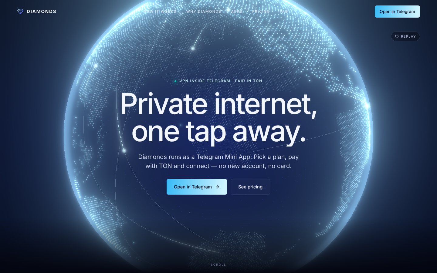
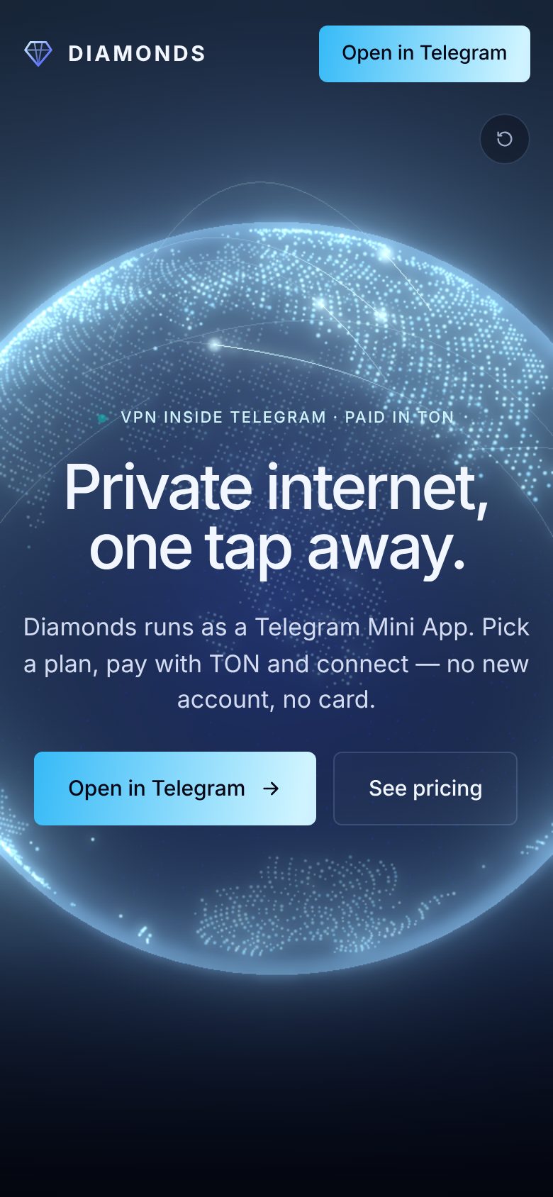
- A neon diamond flies in, charges up and explodes into about 13,000 particles. The particles then rebuild into a dotted Earth, with real continents from Natural Earth data. The headline, “Private internet, one tap away”, appears over the globe with the line “VPN inside Telegram · paid in TON”.
- Why
- The name (Diamonds) and the promise (private access anywhere) become one picture. The headline still says plainly what the product is, which the original didn’t.
- Rejected
- Reusing the original’s static globe image, and placing the globe to the side of the text. A centred globe, large like a planet seen from orbit, made a stronger first screen.
2 One particle world across the whole page
- Decided
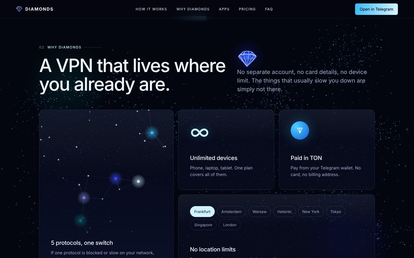
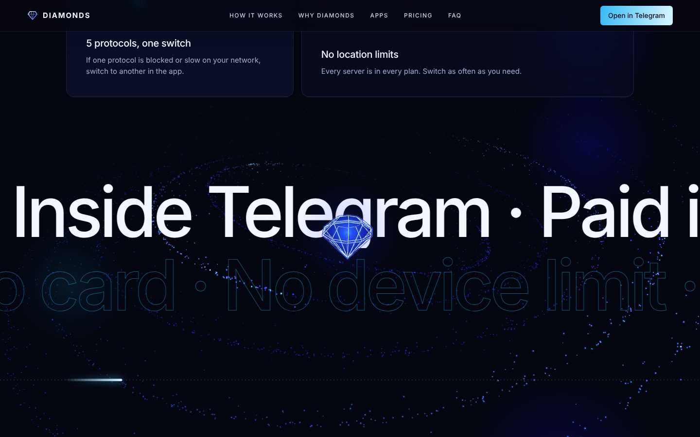
- After the hero, the same particles stay behind the content and change shape per section: a planet horizon, a constellation, orbits, a wireframe diamond behind pricing, and a small globe at the closing call to action. Cards are semi-transparent so the particles show through.
- Why
- In the first build the page went flat and dark right after the hero, and it read like two different sites. Carrying the particles through keeps the concept whole, and ending on the globe closes the story.
- Rejected
- Decorative gradients alone. They added colour but not continuity.
3 A small diamond that travels with the visitor
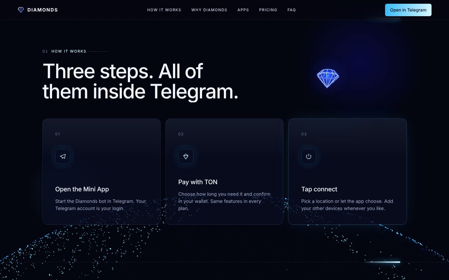
- Decided
- After the hero, a small 3D diamond follows the scroll. It rests in empty space in each section and leans slightly toward the cursor. It lands on the corner of a card when you hover it, and it bursts into sparks when a main button is clicked.
- Why
- It ties the brand to every section and rewards exploring without adding text.
- Trade-off
- Motion can distract from reading. The diamond is small, sits in empty space, stays hidden on the hero, and has no hover behaviour on touch screens.
4 One action everywhere: Open in Telegram
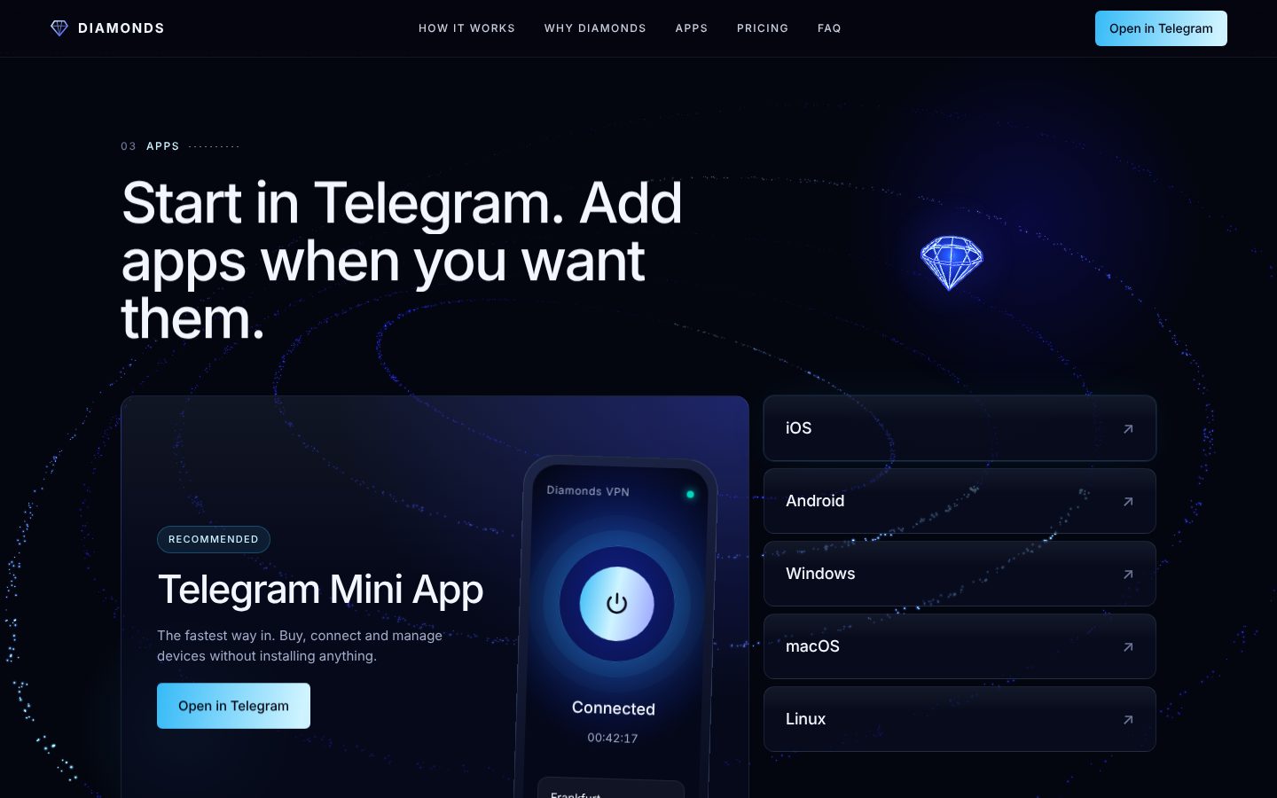
- Decided
- The same gradient button in the nav, hero, apps card, pricing and closing section.
- Why
- The Mini App is where people pay and connect, so the website’s only job is to get people there. The original “Start Now” didn’t say where it led.
5 Prices on the page, best value in the middle
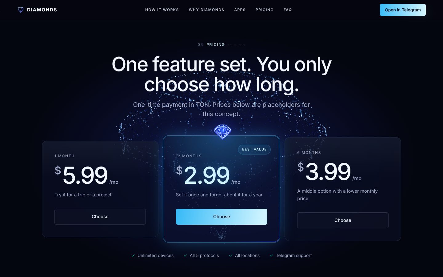
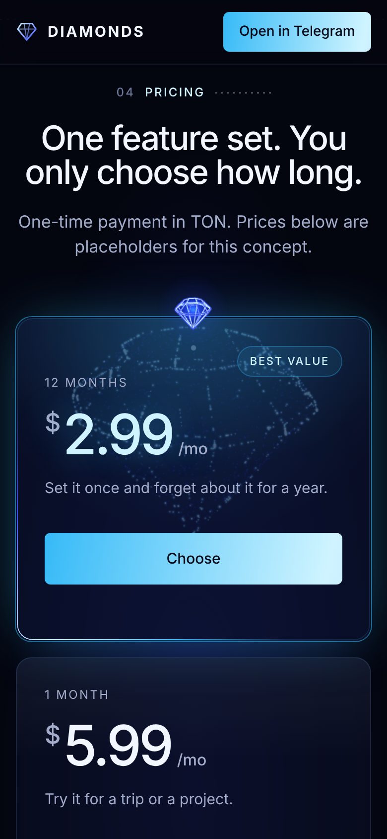
- Decided
- Three plans with one feature set; only the length changes. The 12-month plan sits in the centre, raised, with an animated border. On mobile it comes first.
- Why
- “Flexible pricing” with no numbers makes people leave to compare. When every plan has the same features, the only decision is how long.
05
Final site
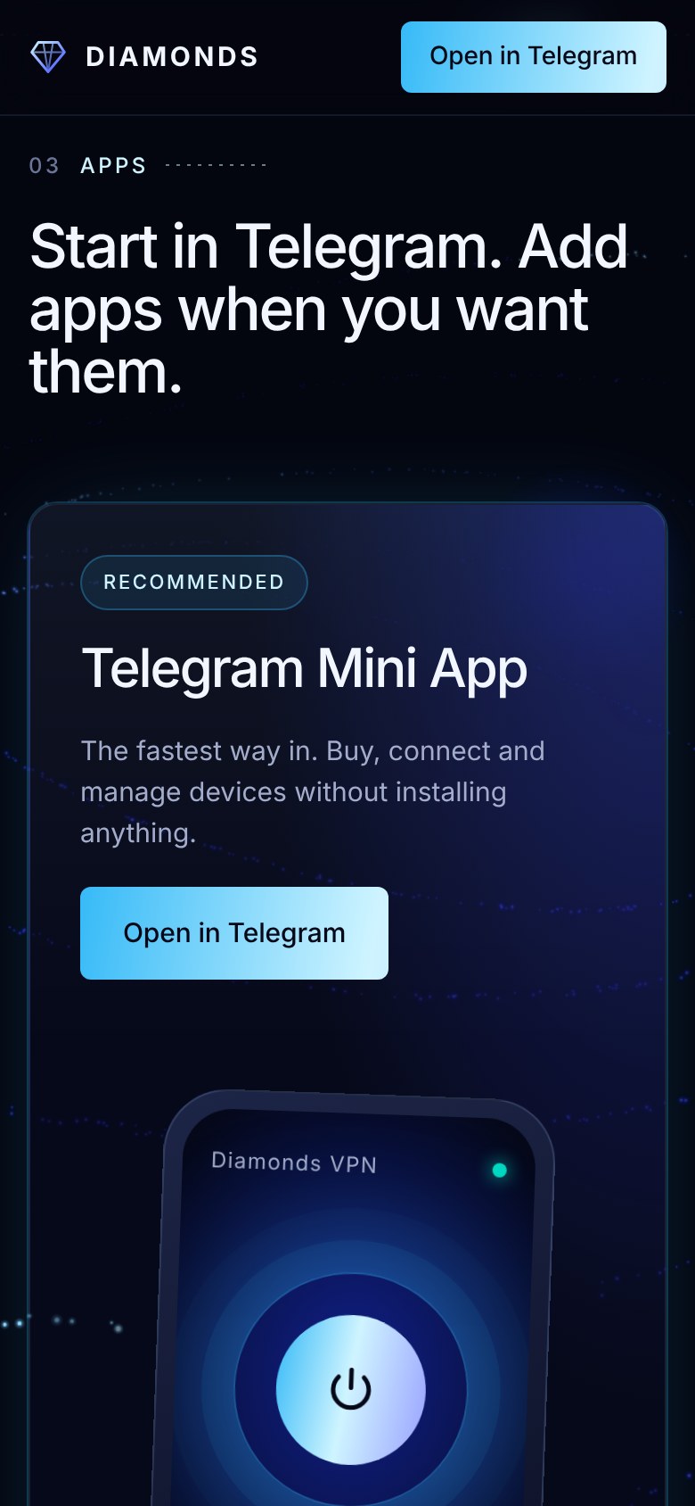
One long homepage, live in the browser: it runs in the window at the top of this page. On phones the 3D scene is lighter.
| Section | What it does | Particle shape behind it |
|---|---|---|
| Hero | Diamond, explosion, globe; headline, subline, two buttons, Replay | The globe itself |
| Key facts | 5 protocols, unlimited devices, 2 taps, 0 location limits | Planet horizon |
| How it works | Three steps, all inside Telegram | Planet horizon |
| Why Diamonds | Bento: protocols, devices, TON payment, locations | Constellation |
| Moving text | Large kinetic line that moves with the scroll | Orbits |
| Apps | Telegram Mini App first, with a phone mock; native apps as a list | Orbits |
| Pricing | Three plans, 12 months in the centre | Wireframe diamond |
| FAQ | Buying questions first: no TON, install, devices | Drifting stars |
| Closing CTA and footer | “Two taps to private.” | Small globe |
States and details covered
- Reduced motion: the intro is skipped and the globe shows straight away; scroll animations are turned off.
- Mobile: smaller globe and particle counts, plans stacked with the best one first, no cursor effects.
- Hover: cards light up near the travelling diamond, buttons follow the cursor slightly, the phone mock tilts.
- FAQ: animated open and close.
- Performance: the hero scene stops rendering once it is scrolled out of view, 3D layers render at a fixed pixel budget so 4K screens stay smooth, and quality drops automatically on slow devices. The first 4K test stuttered between the hero and the next section; these changes fixed it.
Prices are placeholders for the concept and are labelled as such on the page. The footer says it is a concept redesign and that the product is no longer operating.
06
Outcome & learnings
This is a concept, so there are no results to report. What it shows is how I take a product from “unclear and generic” to a site that explains itself and feels like the brand.
What is assumed (not from the original site): plan prices and lengths, the “2 taps” claim, the city list on the locations card and the FAQ answers. A real project would confirm these with the team first.
Motion needs a story, not effects
The intro works because it says one thing: diamond becomes the world. Each particle shape later on had to earn its place the same way.
The first screen sets a promise
My first build had a strong hero and a flat page below it. Continuity mattered more than adding effects.
Building in code changed how I design motion
With AI-assisted coding I could judge real motion in the browser, not describe it in a prototype. Timing, scale and contrast were decided by looking, not guessing.
Keep the structure, replace the look
The audit and page structure from the Figma round carried straight into the live site.
What I would test next: a 5-second test of the hero against the original (“what is this product?”), and frame rate on low-end Android phones, which I haven’t measured yet.