01
Context & my role
PostPixel is a live web app that writes and designs social media posts for local service businesses with AI and publishes them on a schedule. The owner reviews and approves; the app does the rest.
I was the outsourced product designer and the only designer on the app. I designed it end to end: information architecture, user flows, wireframes, a UI Kit and the final UI. The founder owned research and product direction; I worked from his brief.
The screens show the latest iteration of my design. The live product is close to it, with some differences in details. The business in the screens (Bright Plumbing) and every number in the UI are sample data, not product results.
02
Problem
Owners of small service businesses (plumbers, roofers, cleaners) know they should post regularly, but they have no time and no marketing skills. Posting stops after a few weeks, and the business looks inactive to people who check it before calling.
AI can already write and design posts. The hard part is trust and effort: owners will not use a tool that posts something wrong in their name, or one that takes an hour a week to manage.
Design question
How do we get an owner from sign-up to a month of approved posts in one sitting, and keep their weekly effort to a few minutes?
Who it is for
Mike, who owns a plumbing company, and Sara, who runs posting for several local clients. Both come from the founder’s brief; I did not validate them myself.
03
Process highlights
There was no research budget on my side, so I turned the founder’s brief into a few rules the whole team could check designs against: one job to be done and four principles.
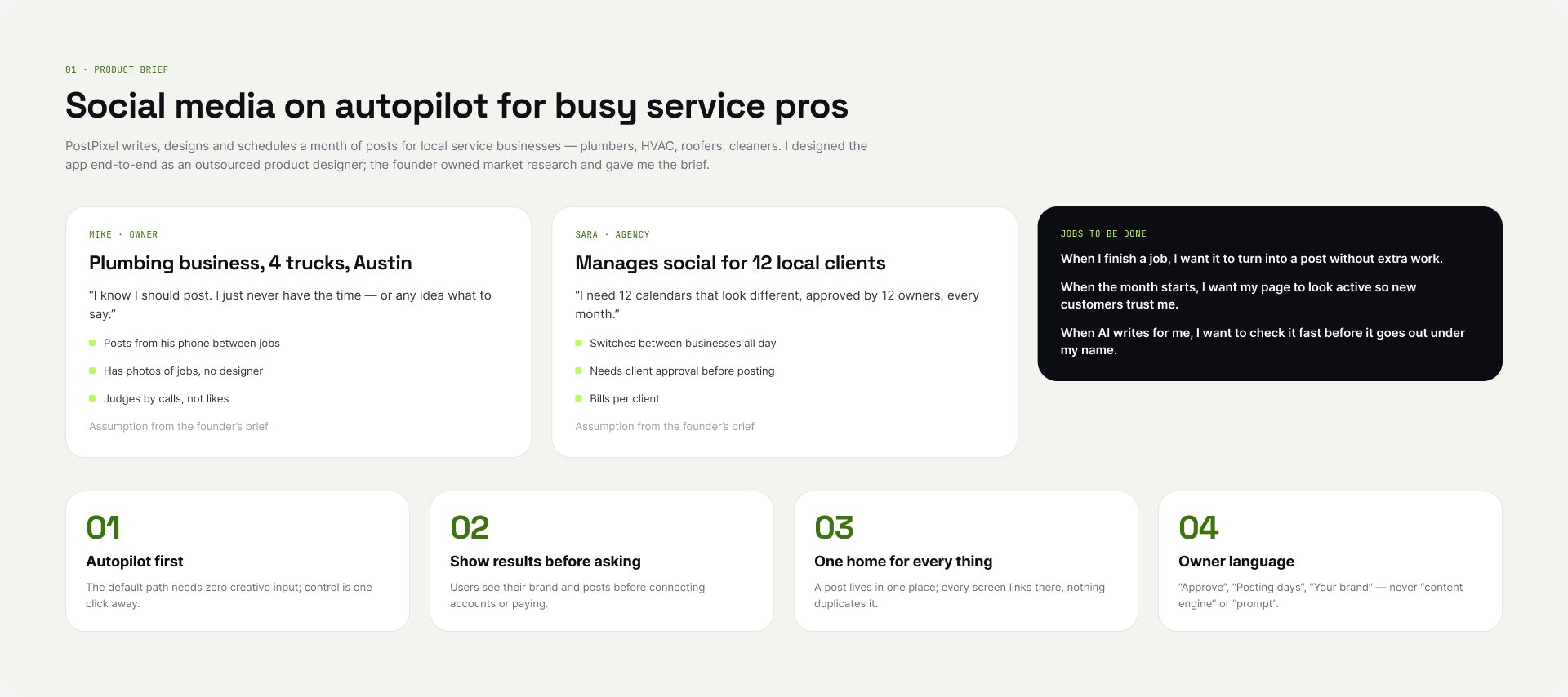
Autopilot first
The default is that posts go out; the owner steps in only when needed.
Show results before asking
Show generated posts before asking for setup details or payment.
One home for every thing
Each object (post, photo, brand setting) lives in one place only.
Owner language
“Posts”, “needs your OK”, “people saw your posts”. No “impressions” or “content pillars”.
Information architecture
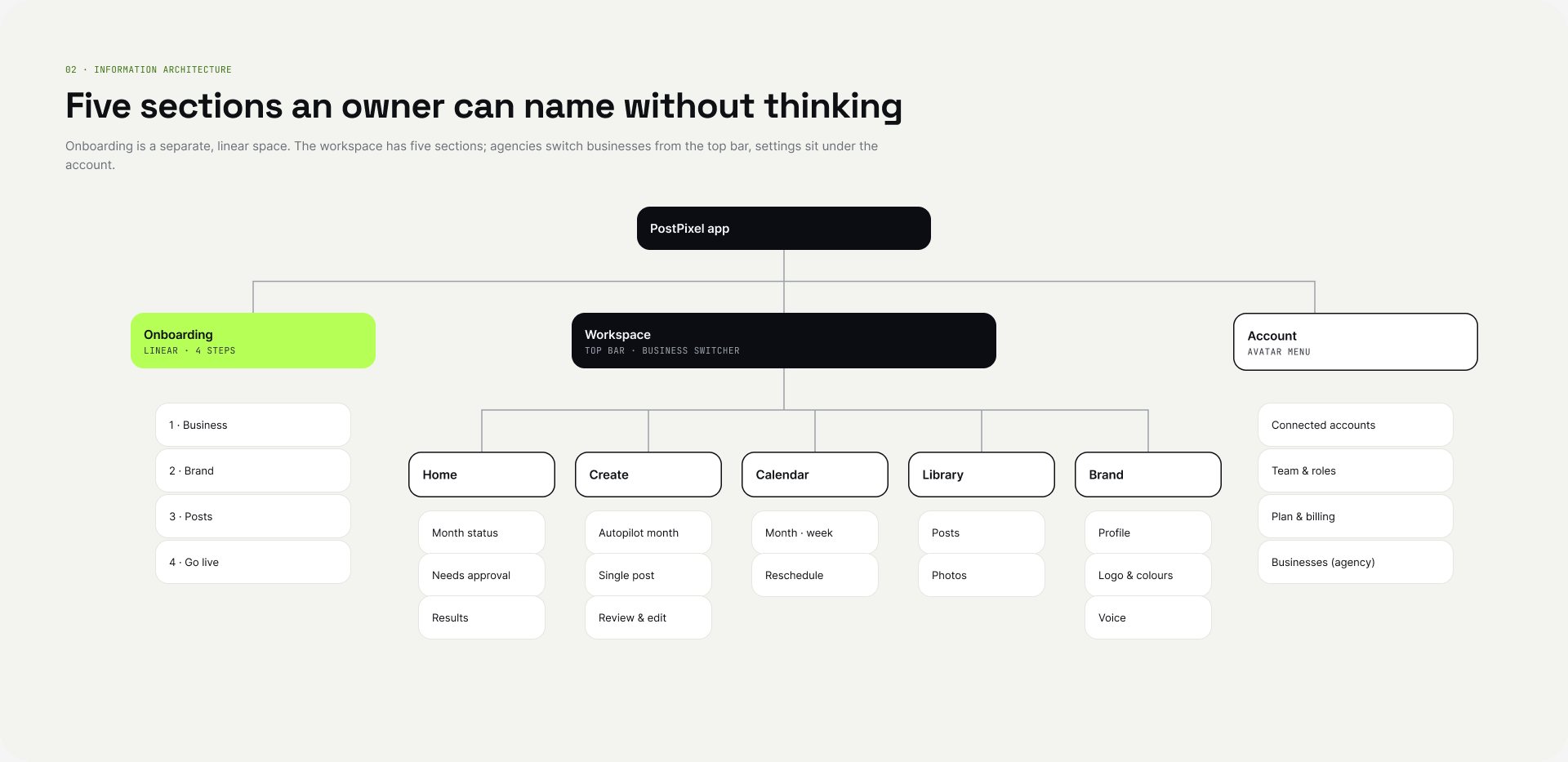
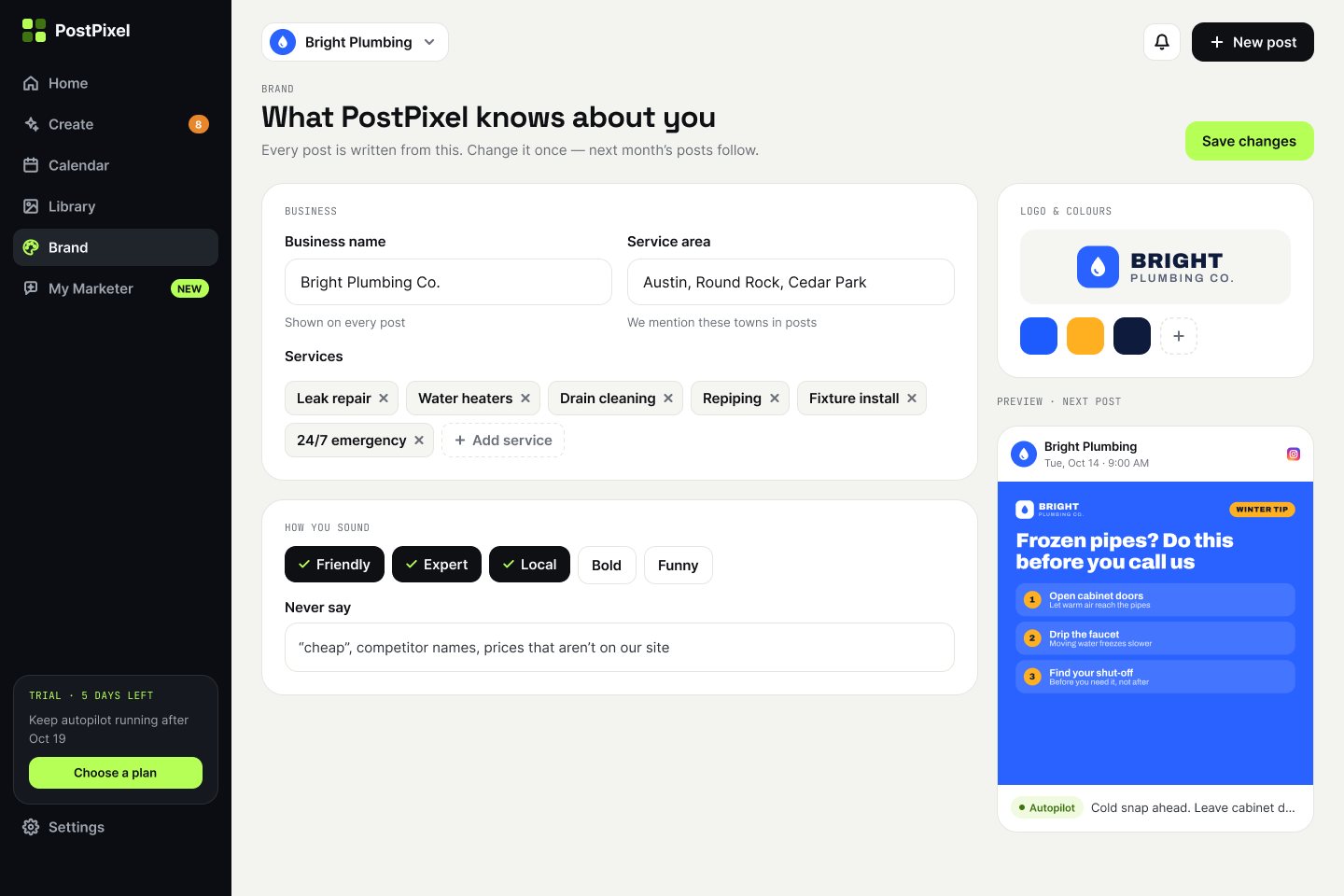
Onboarding is a separate, linear space. The workspace has five sections an owner can name without thinking: Home, Create, Calendar, Library and Brand. Agencies switch businesses from the top bar. My Marketer was added later as an add-on section.
User flows
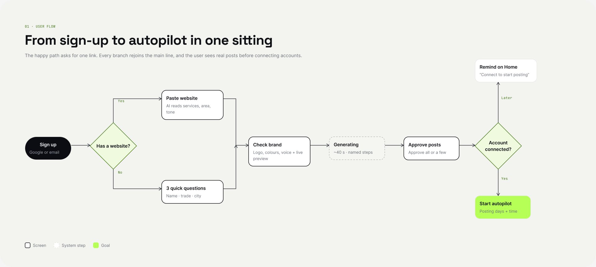
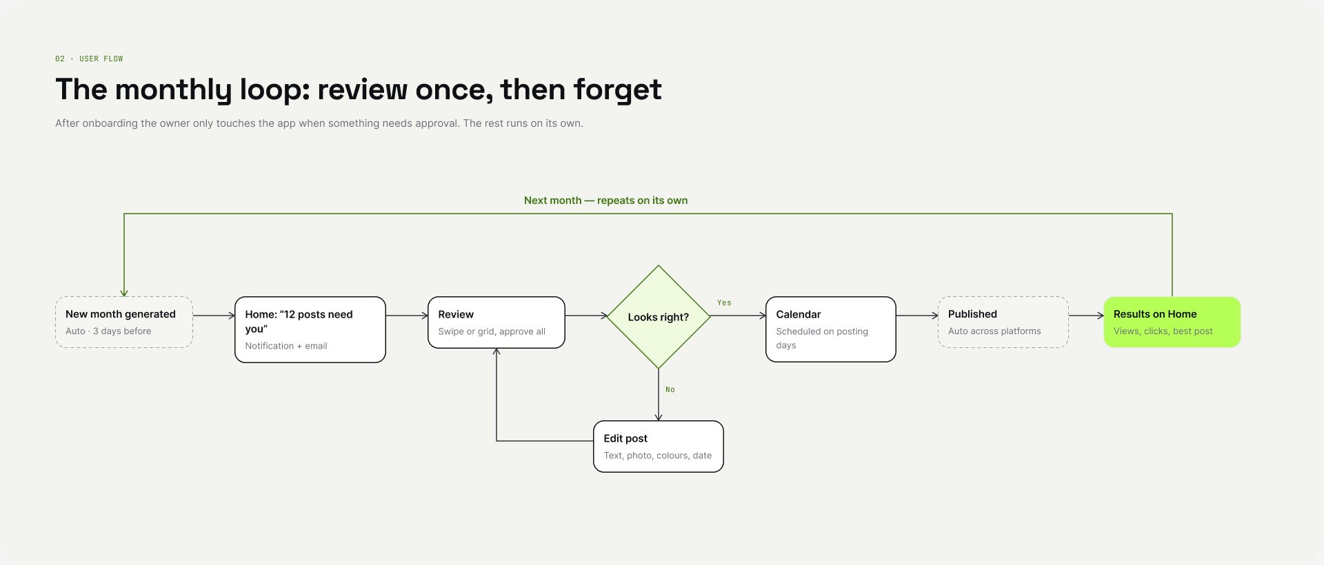
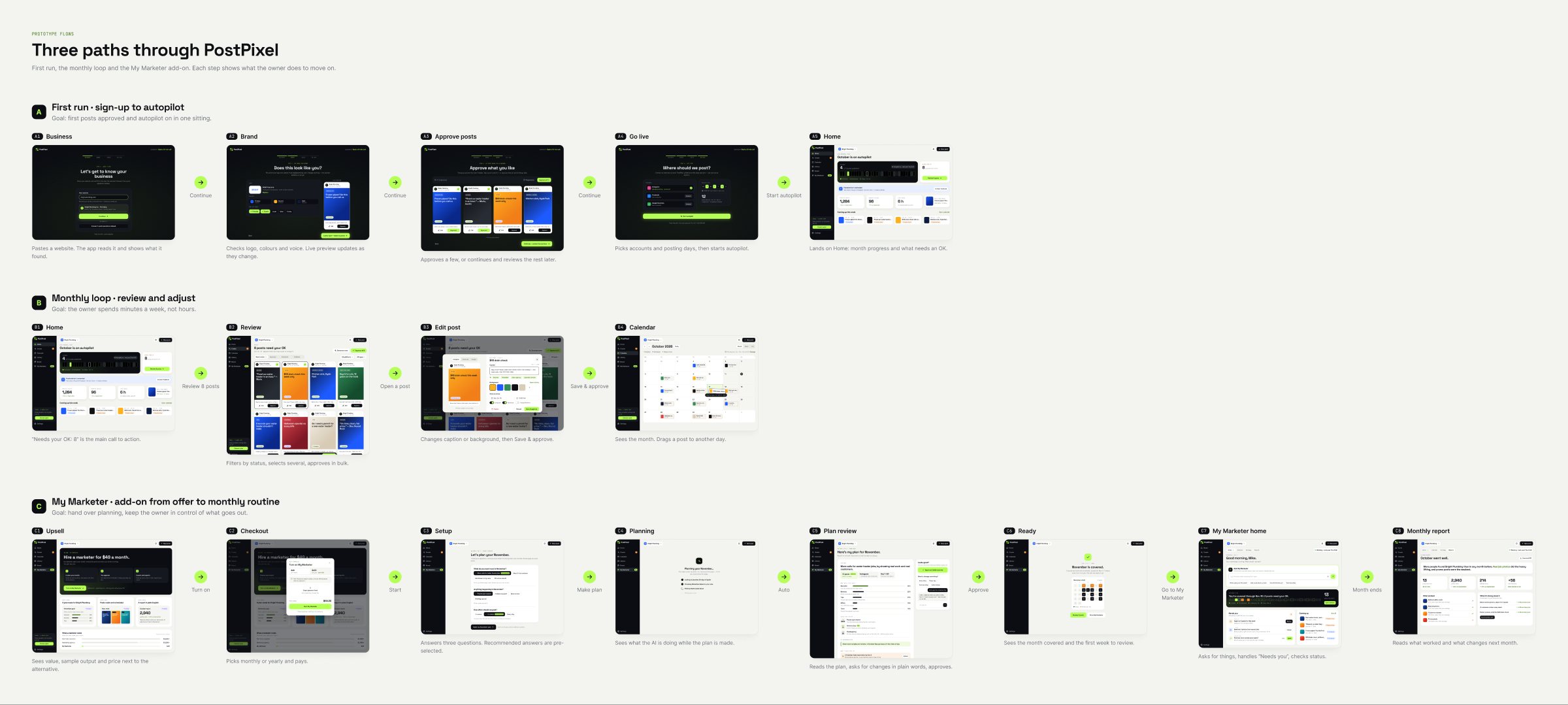
I mapped three flows: the first run, the monthly loop and the My Marketer add-on. The flows decided which screens existed.
Wireframes
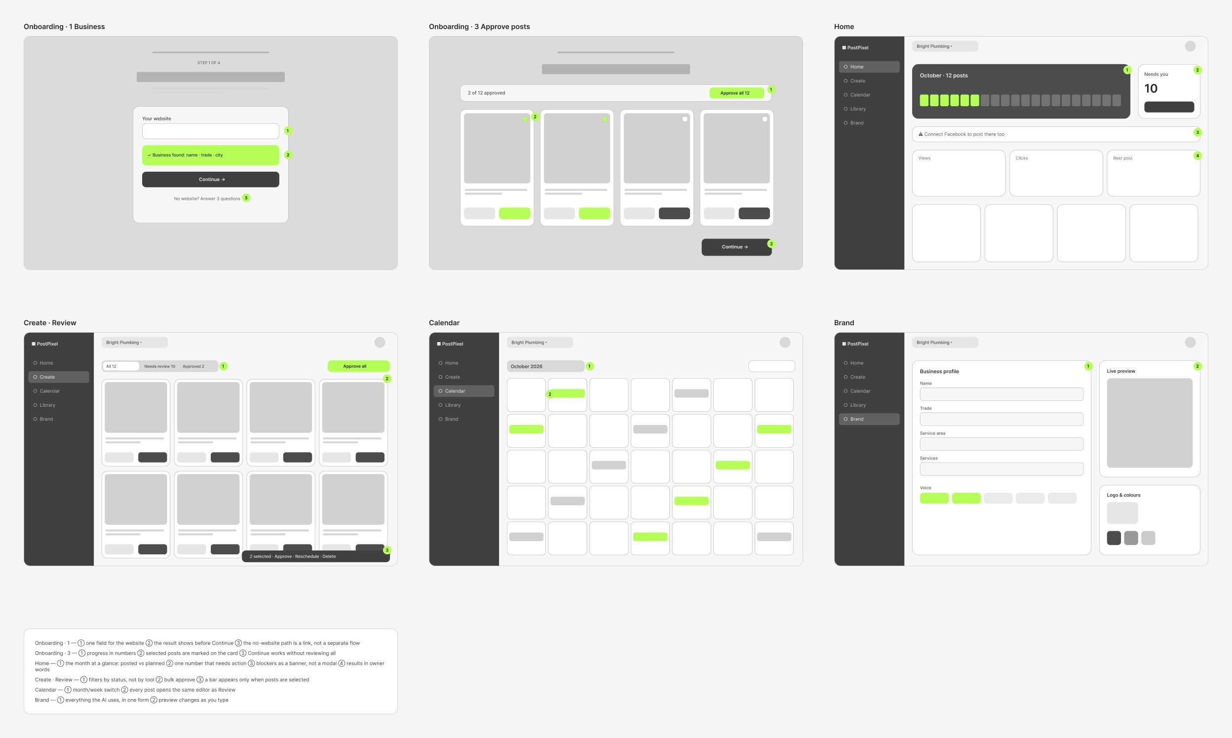
Six wireframes tested layout before any visual work. Each numbered note is a decision I wanted the founder to agree on before we moved on.
UI Kit, not a design system
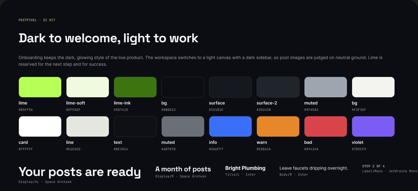
For a small team that needed to ship, I built a UI Kit: colour and type variables, 28 icons, and the components the screens actually use (Button, Status Pill, Tab, Input, Nav Item, Post Card, Toggle, Onboarding Progress).
04
Key decisions
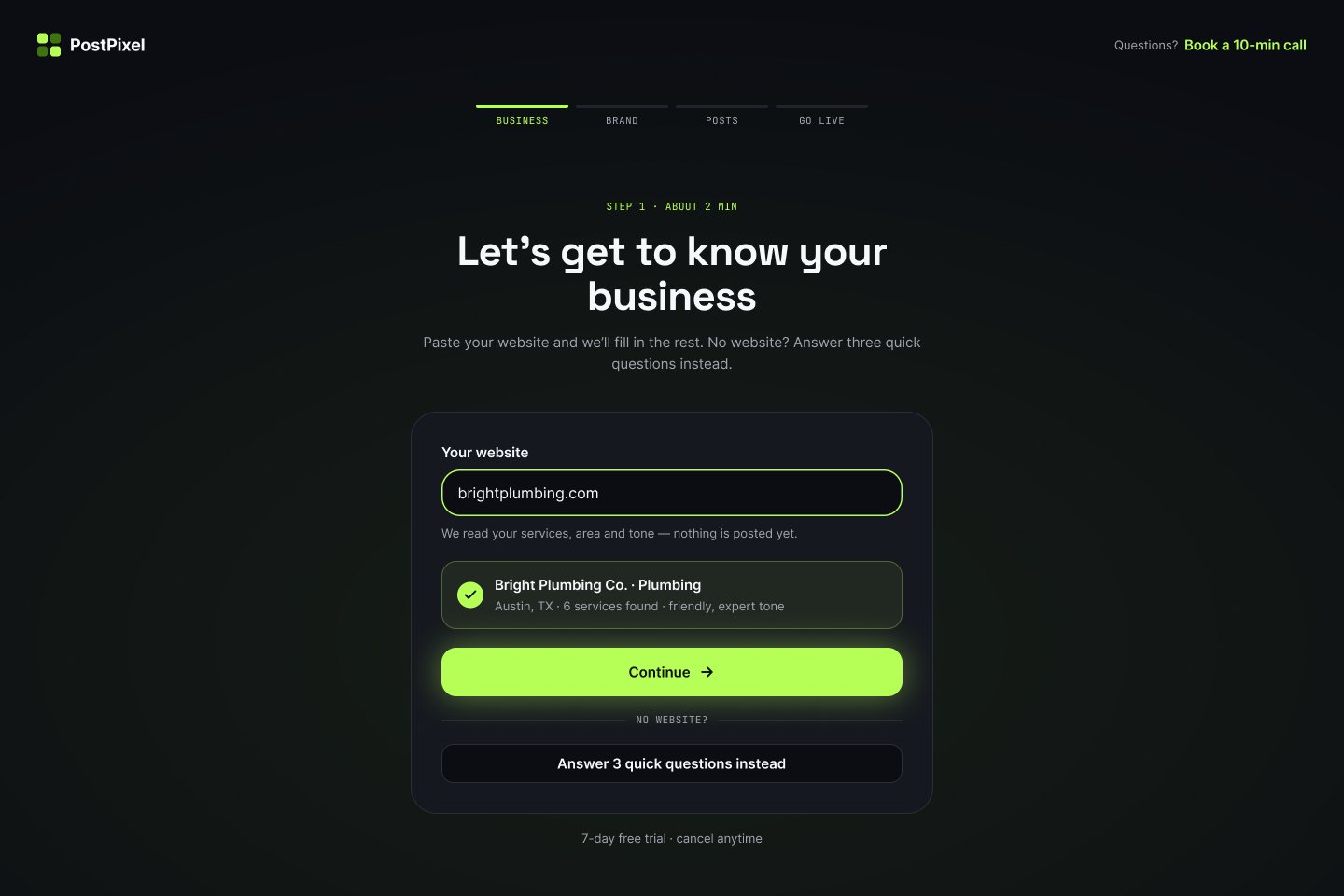
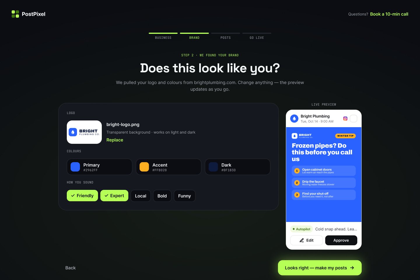
1 Start from the website, not a form
- Decided
- Onboarding starts with one field: the business website. The app reads it and shows what it found right below (services, area, tone), and the owner only corrects it. There is a short path for businesses without a site.
- Why
- Owners don’t know how to describe their “brand voice”, but they can recognise it. Correcting is faster than writing.
- Rejected
- A 10-question setup form before the first post.
2 Approve a few posts, not all of them
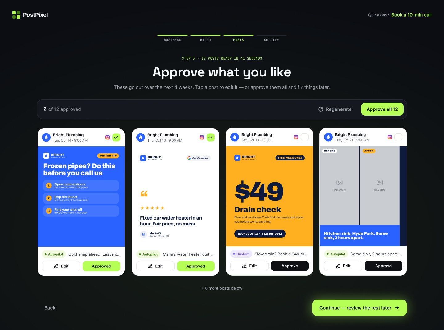
- Decided
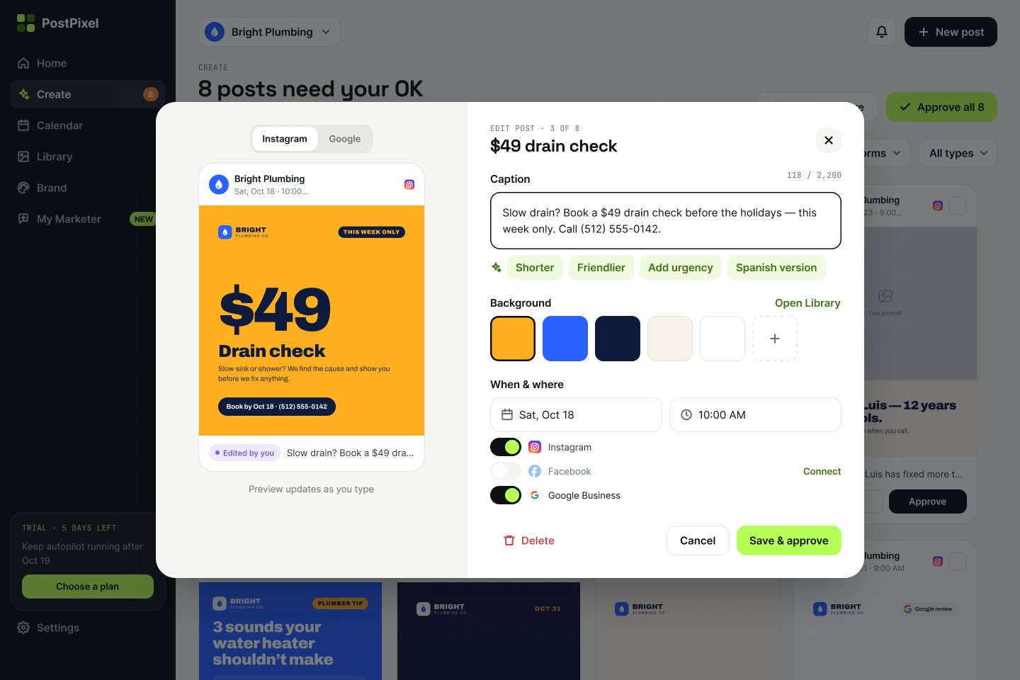
- Step 3 shows the first posts and lets the owner approve some, then “Continue — review the rest later”. The rest wait in Create.
- Why
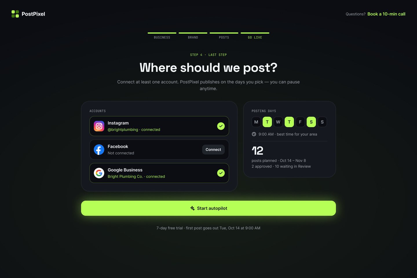
- Forcing all 12 approvals at sign-up turns the best moment (seeing your posts) into homework. Auto-posting without any review breaks trust.
- Rejected
- “Approve all to continue” and “publish without review”.
3 Home answers one question: is my marketing running?
- Decided
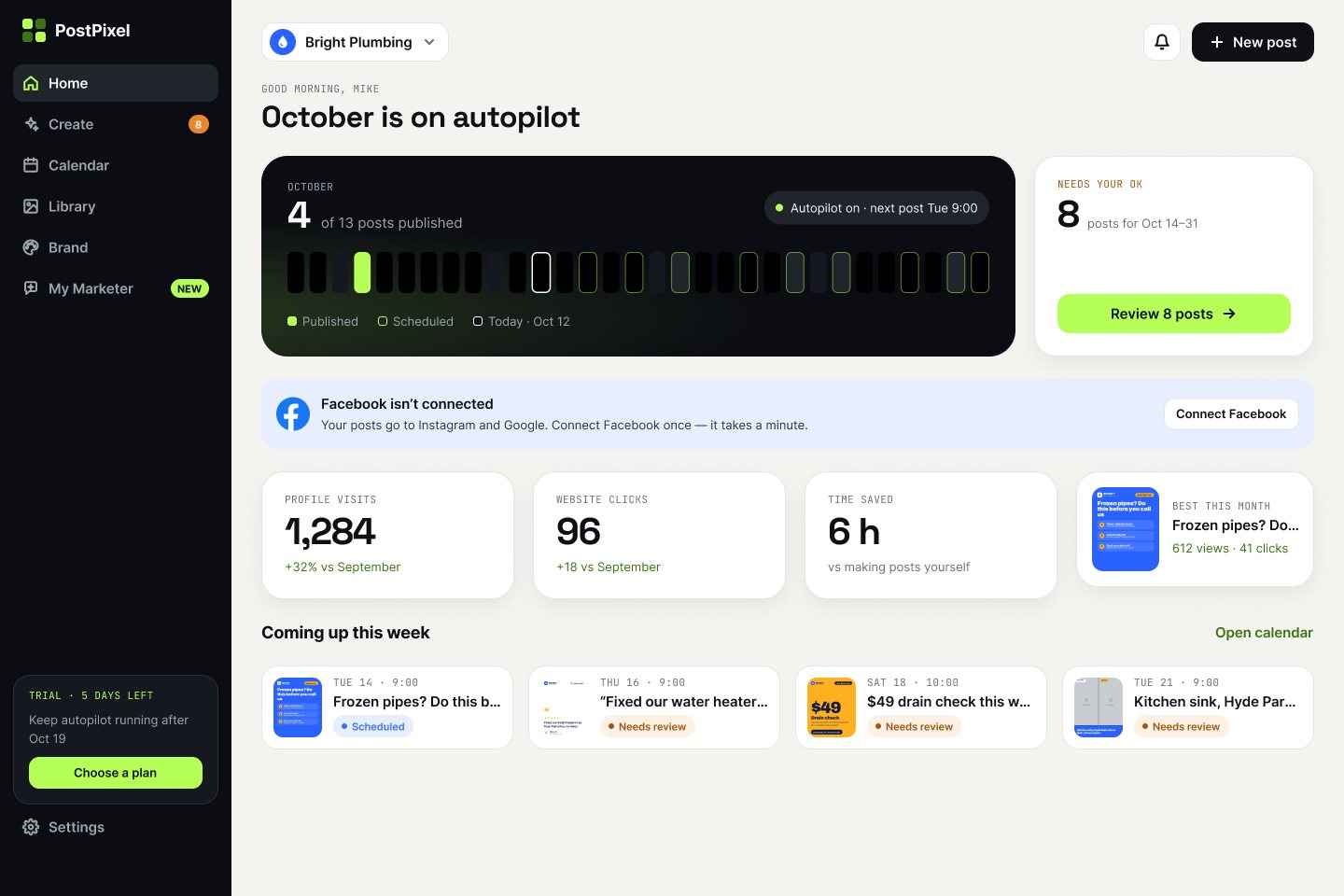
- Home (shown at the top of this page) shows the month as a strip of days (posted, scheduled, today) and one card with the number of posts that need an OK. Results sit below, in owner words.
- Why
- The weekly visit is short. The owner needs status and one action, not a dashboard.
- Rejected
- An analytics-first home with charts.
4 One place for posts, three ways to look at them
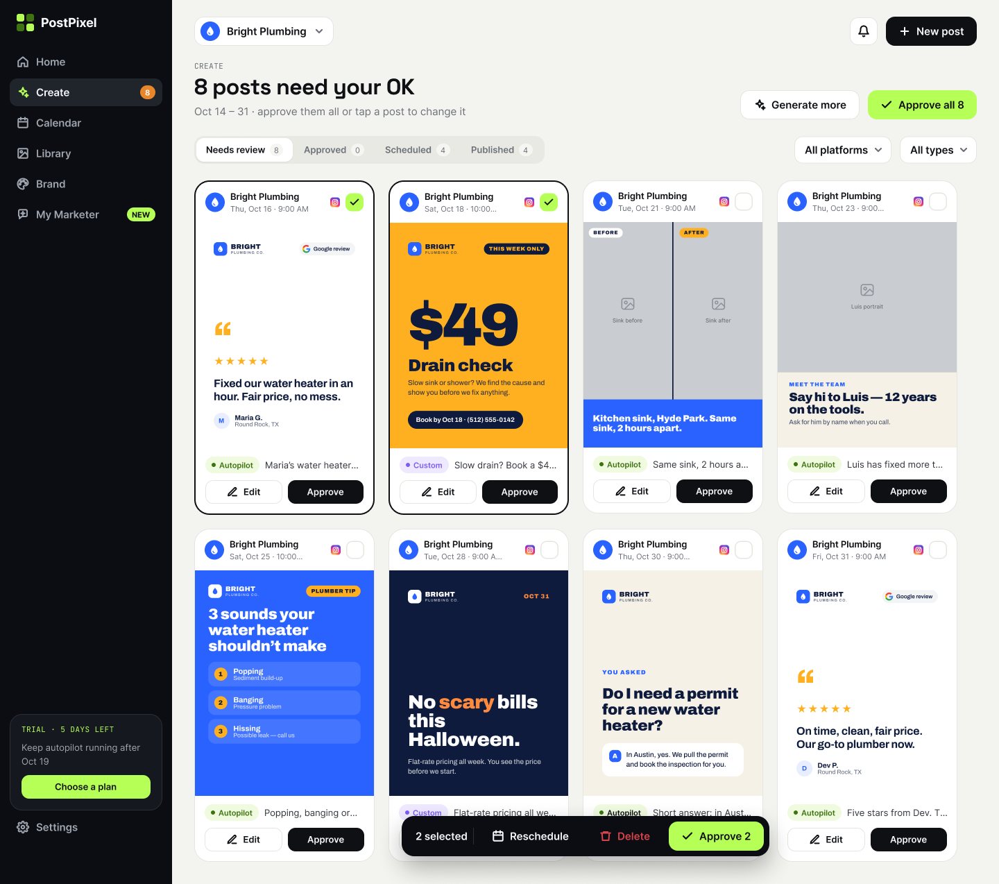
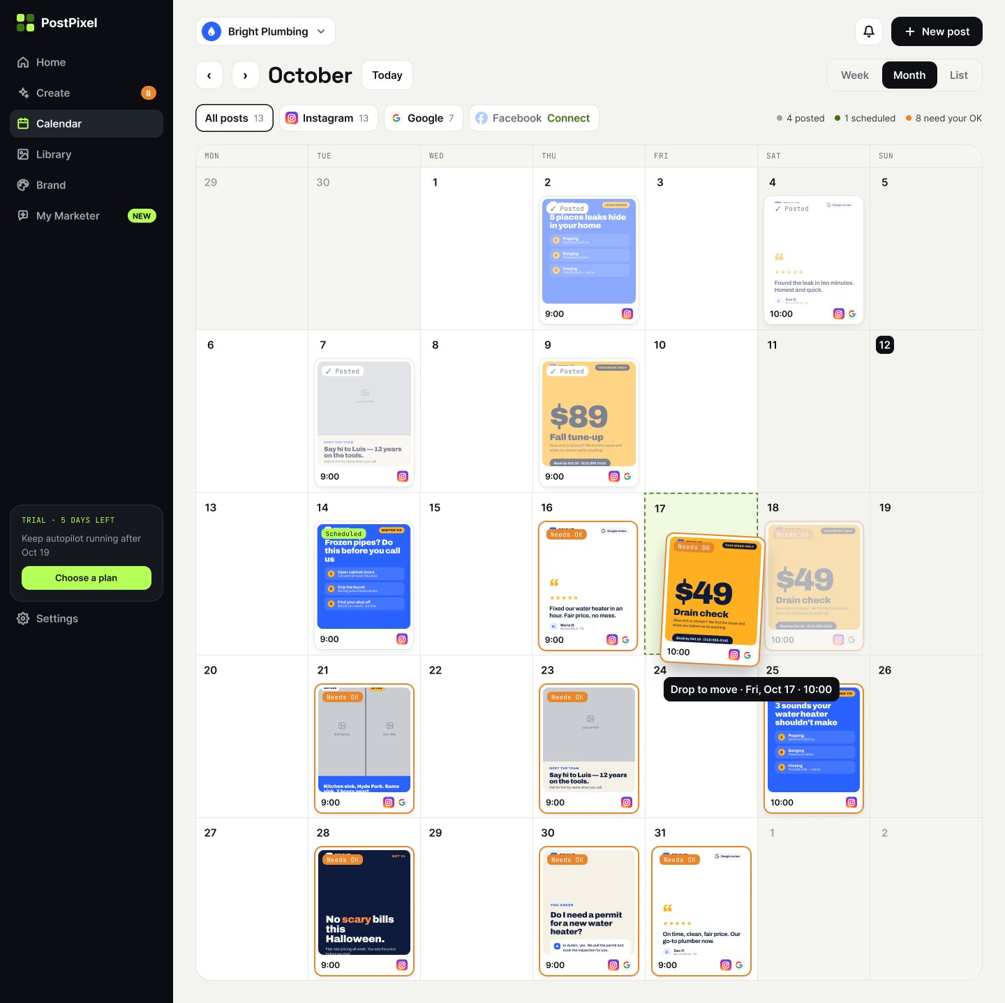
- Decided
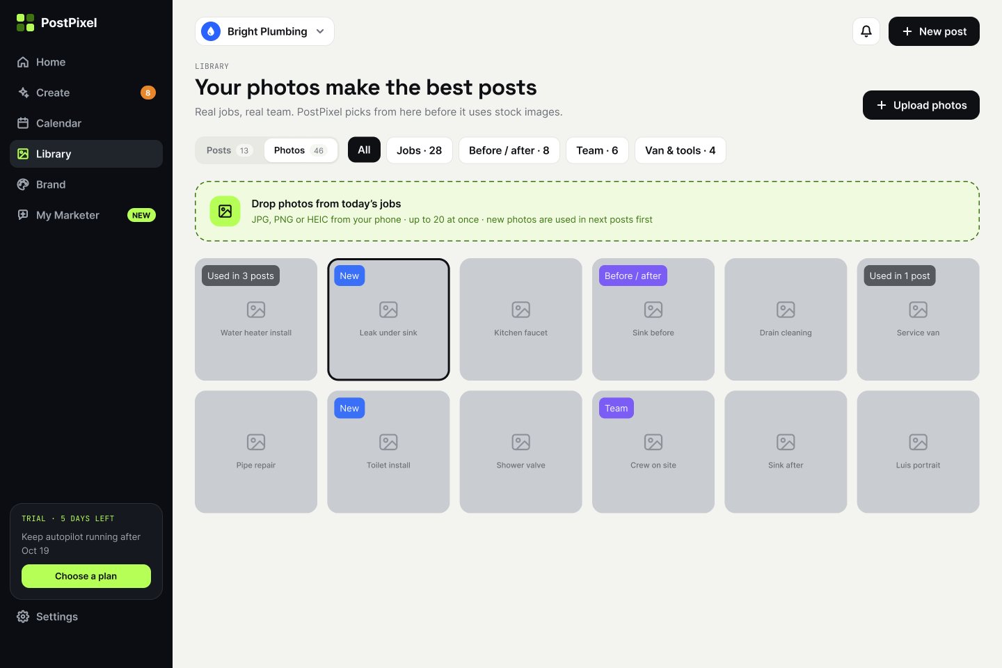
- Every post lives in Create. Review shows posts by status with bulk approve; Calendar shows the same posts by date with drag to reschedule; Library holds photos only.
- Why
- Principle 3. If a post can be in two lists, people stop trusting either.
- Rejected
- Separate “Drafts”, “Scheduled” and “Published” pages.
See the calendar before the founder’s feedback
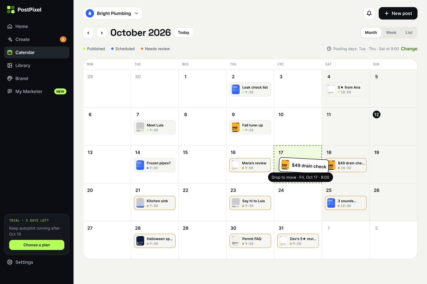
The first version showed posts as small chips. After the founder’s review, month cells show the post itself, with filters by platform.
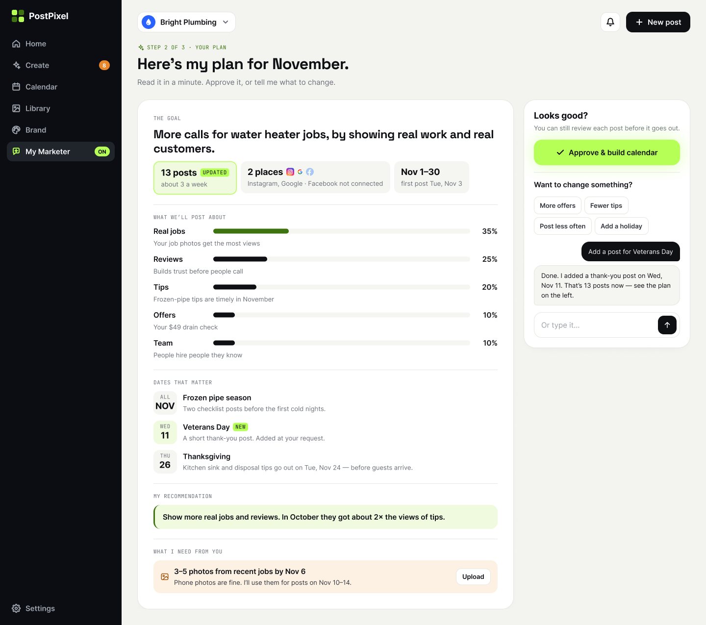
5 My Marketer plans in plain words, and the owner keeps the last word
- Decided
- The add-on writes a one-page monthly plan the owner can read in a minute. Changes are asked in plain words (“Add a post for Veterans Day”) and appear in the plan, marked as updated. Nothing is posted until the owner approves.
- Why
- Owners buy an outcome, not a chatbot. A document is easier to check than a conversation.
- Rejected
- A chat-only interface, where the plan is scattered across messages.
05
Final UI
The visual idea is dark to welcome, light to work. Onboarding and key moments are dark with a lime accent, in the style of the live product. The everyday workspace is light with a dark sidebar, so posts and their colours read clearly.
Onboarding
Workspace
My Marketer add-on
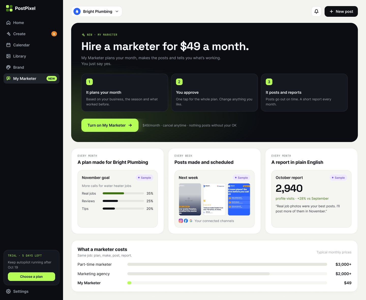
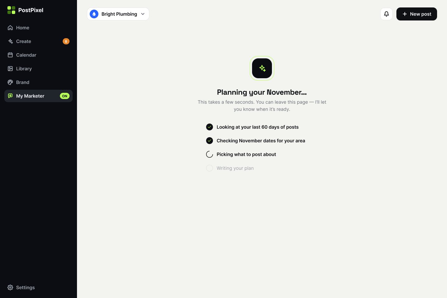
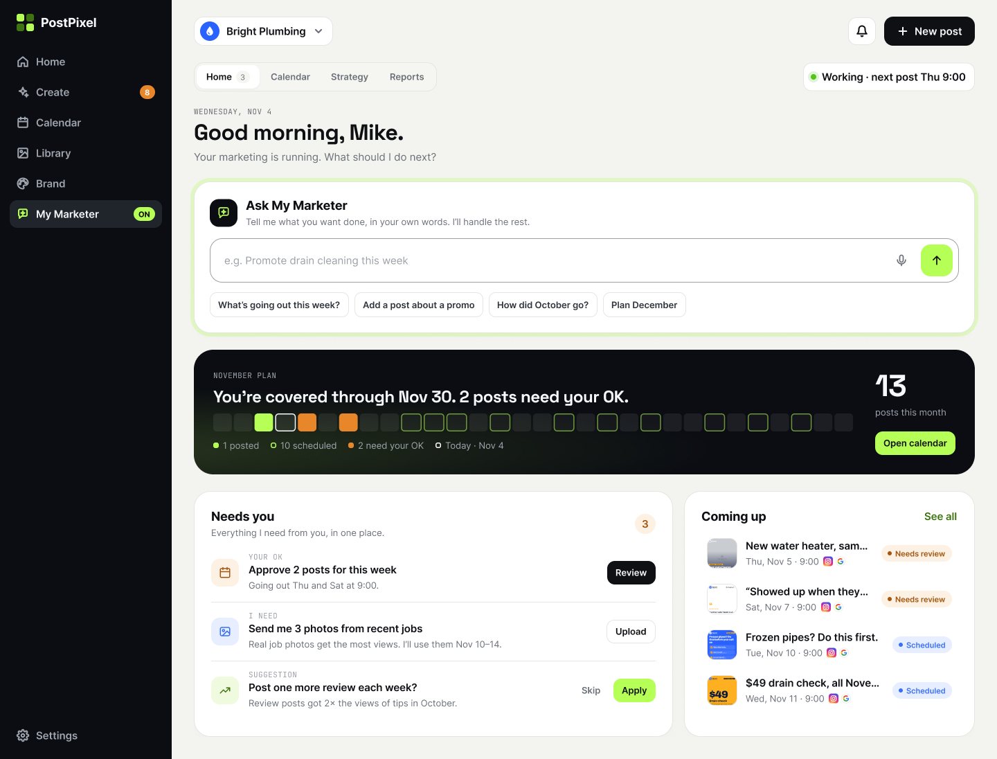
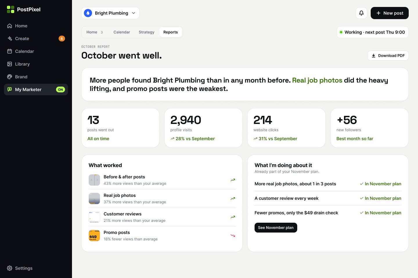
- States, not only happy paths. No website, account not connected, partial approval, multi-select, drag in progress, loading as a step list, plan updated after a request.
- Sample labels. Upsell previews are marked “Sample”, so the owner never mistakes an example for their own results.
06
Outcome & learnings
What exists now: PostPixel is a live product at postpixel.ai, and the onboarding and My Marketer flows exist as clickable prototypes the founder can test with users. I don’t have usage data from the product, so this case shows no result metrics.
Principles beat taste in reviews
Without research of my own, “one home for every thing” and “owner language” gave the founder and me a shared way to judge a screen, instead of arguing about preferences.
The first win matters more than the full setup
Letting owners approve a few posts and move on felt riskier than forcing all approvals, but it keeps the best moment of onboarding short.
AI features need a document, not only a chat
For My Marketer, a readable plan made the AI’s work checkable. Chat stayed, but as the way to change the plan.
What I would test next
Time from sign-up to the first approved post, how many owners use “review the rest later” and come back, and whether owners read the monthly report.