01
Context & my role
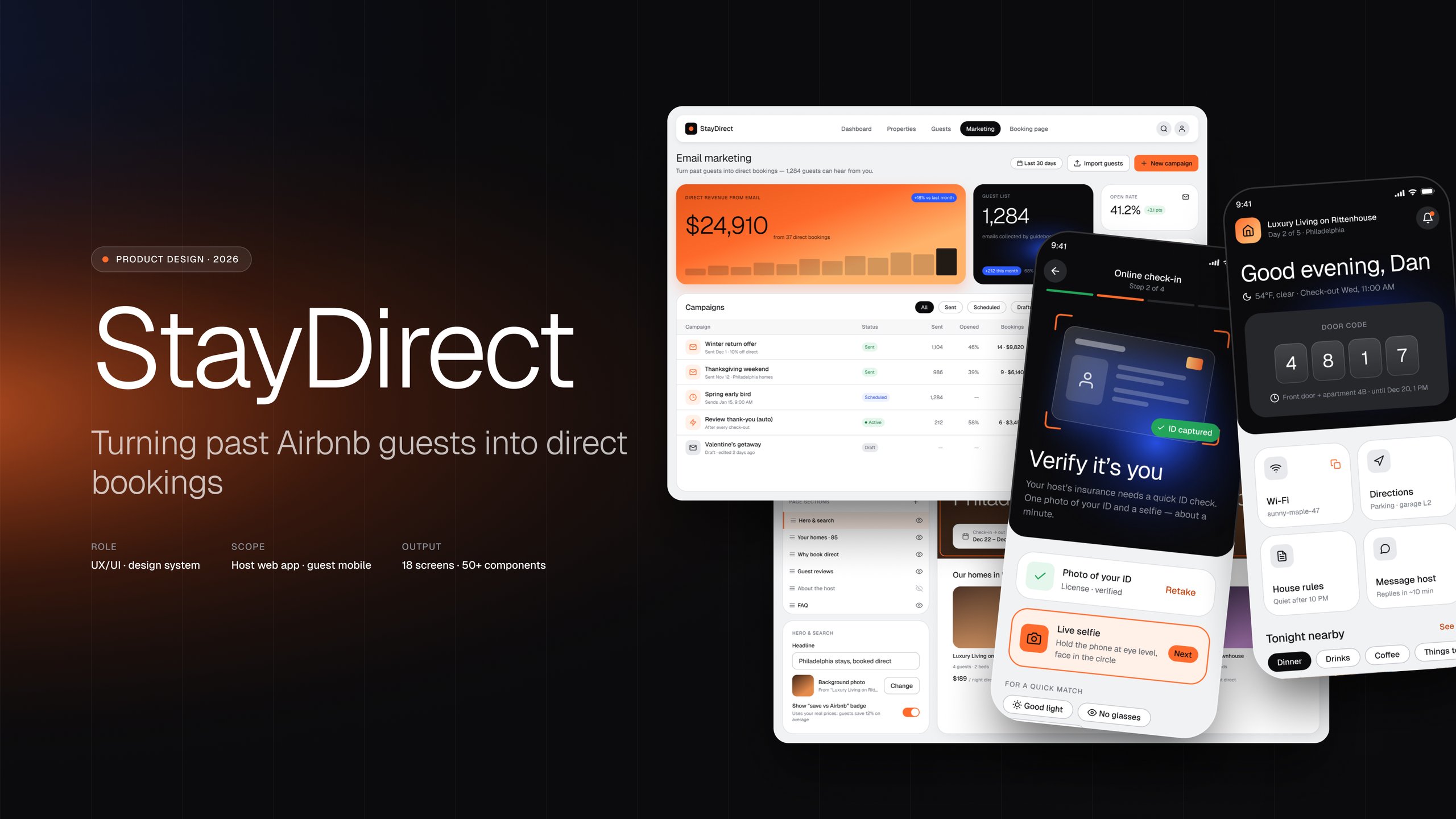
StayDirect is a web platform for short-term rental hosts who want guests to book them directly instead of through Airbnb. The founder runs 80+ rental properties himself, so the product grew out of his own operations.
Host side · desktop
Import listings from Airbnb or Guesty, get an AI-written guest guidebook for each property, build a direct booking page, send email campaigns to past guests.
Guest side · mobile web
Online check-in before arrival, then a Guest Hub during the stay: door code, Wi-Fi, local tips, check-out steps.
I worked as an outsourced UX/UI designer and was the only designer for the whole project. The product went through two pivots before the MVP, which is why it took about four years. I designed the product screens and built the design system. The client did not share user research; I worked from design tasks and the founder’s product logic.
Because I can’t show the shipped screens, I rebuilt five key flows from scratch for this case. I used it to look at my own work with fresh eyes: I wrote down the user picture as hypotheses, audited what shipped and rebuilt the design system.
02
Problem
Airbnb owns the relationship with the guest. Hosts pay platform fees on every stay and can’t reach a guest again after check-out. StayDirect’s idea is a loop: collect guest emails through a helpful guidebook, then bring guests back to book directly.
- Importlistings
- Guidebookfor every stay
- Guest emailscollected
- Campaignto past guests
- Direct bookingno Airbnb fee
The loop only works if both sides find the product easy:
- Hosts, especially managers with dozens of units, need setup that scales. The shipped onboarding asked to configure listings one by one and only supported Airbnb.
- Guests need check-in to feel quick and safe. The shipped flow had 6 steps, a marketing survey in the middle and prices that changed between steps.
The visual language had also drifted over four years: three different navigation menus, 5+ accent colours with no clear role and four icon styles. That made the product feel less trustworthy, which matters for a service that asks guests to pay outside Airbnb.
Design goals
Setup that scales
A manager with 80+ listings imports them in one pass and enters shared settings once, not per listing.
Check-in that feels quick and safe
Fewer steps, nothing that isn’t about the stay, and one price from the first step to payment.
One visual language
One navigation, one action colour, one icon style and WCAG AA contrast for text.
03
Research (retrospective)
Without access to user research, I rebuilt the user picture from the product brief, the design files, the founder’s profile and public market data. Everything here is a hypothesis, labelled as such.
Mike
A small Airbnb host with a few listings.
Lisa
A property manager with 20–100+ units in Guesty. Closest to the founder.
Anna
A repeat traveller who books the same city again.
| Artifact | What it showed |
|---|---|
| Host CJM, 8 stages | Low points: sign-up friction, “is it even working?” while emails collect, writing campaigns |
| Guest CJM, 8 stages | Lowest point: online check-in. Second: finding the door code and Wi-Fi on arrival |
| Competitor analysis | Airbnb, Hostfully, Touch Stay, Enso Connect. Good guidebooks exist; the full loop for Airbnb and Guesty hosts does not |
| UX audit, 12 issues | 3 high: navigation, check-in survey step, price mismatch. Medium: progress bugs, colour roles, CTA hierarchy, red Delete next to Edit |
The research set the priorities: scale for Lisa on the host side, speed and trust for Anna on the guest side, and one visual language for both.
04
StayDirect Design System: v1 to v2
I built v1 during the project. Looking back, it had the right structure but loose rules: every semantic colour could be used anywhere, spacing was mostly hard-coded, and placeholder text failed contrast (2.5:1). For this case I rebuilt it as v2 and grew it together with the re-created screens.
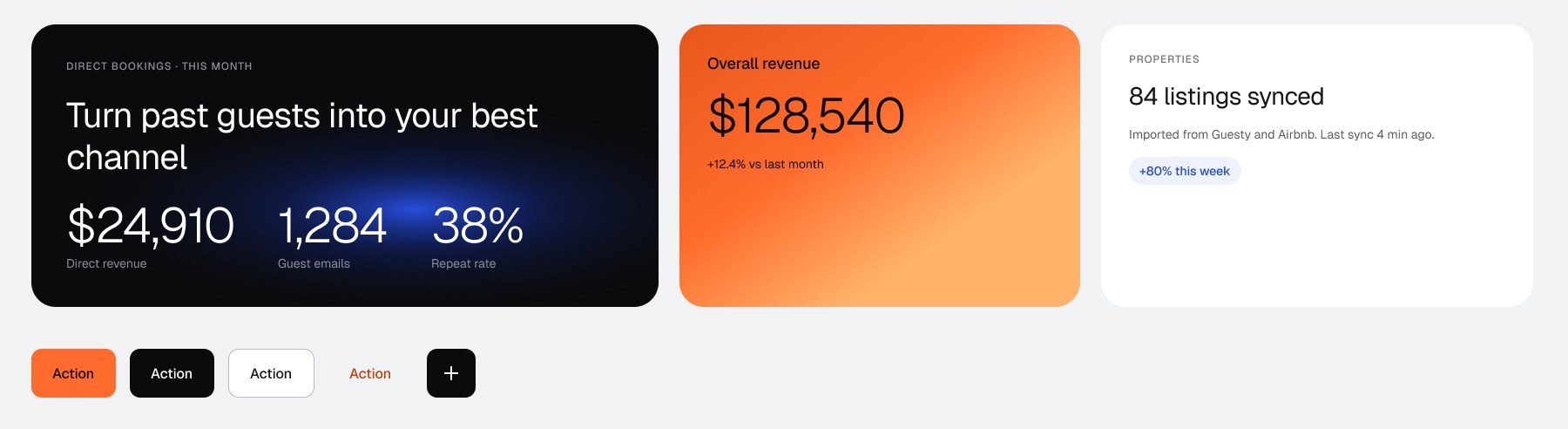
Every new element from the screens went back into the library, documented, before the screens were rebuilt on it. What changed in tokens, colour, contrast and components is in the design system case.
05
Key decisions
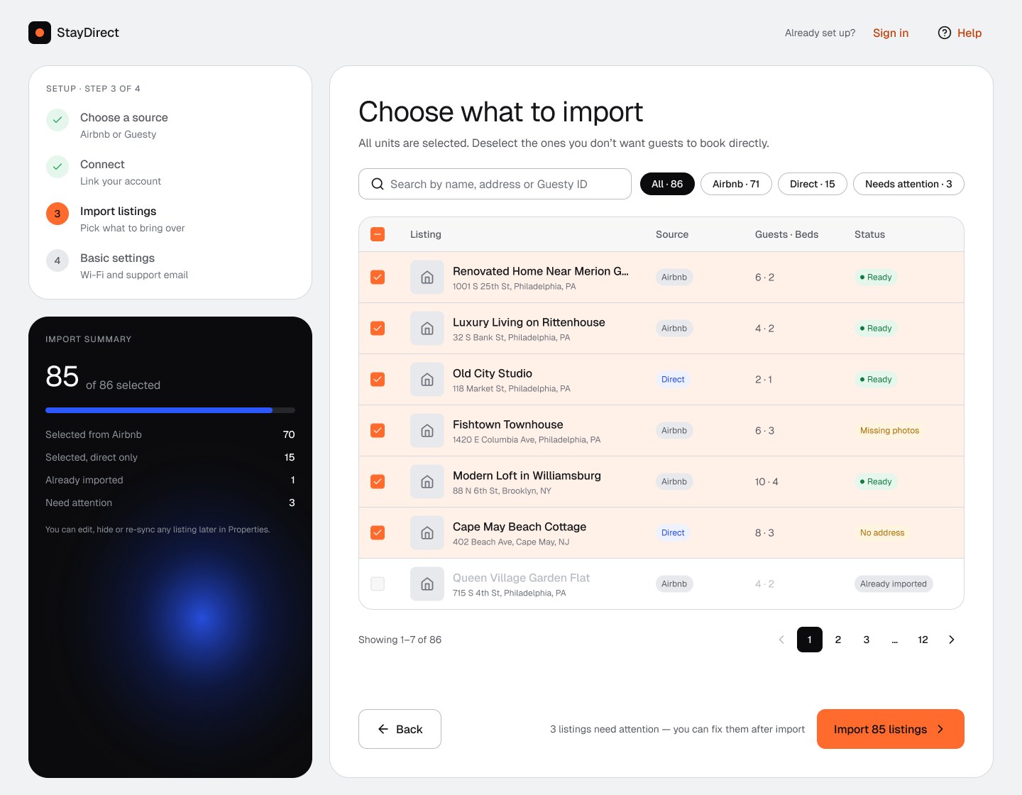
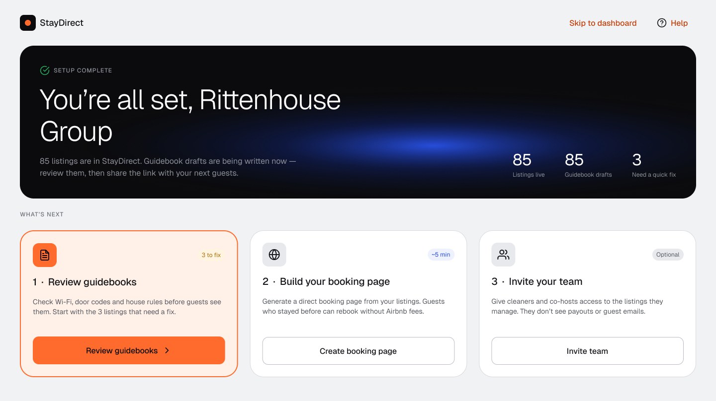
1 Host onboarding: 7 screens to 4 steps that scale
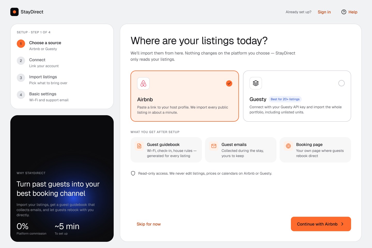
- Two sources, one choice. Airbnb or Guesty as large option cards; the one for big portfolios carries a “Best for 20+ listings” badge.
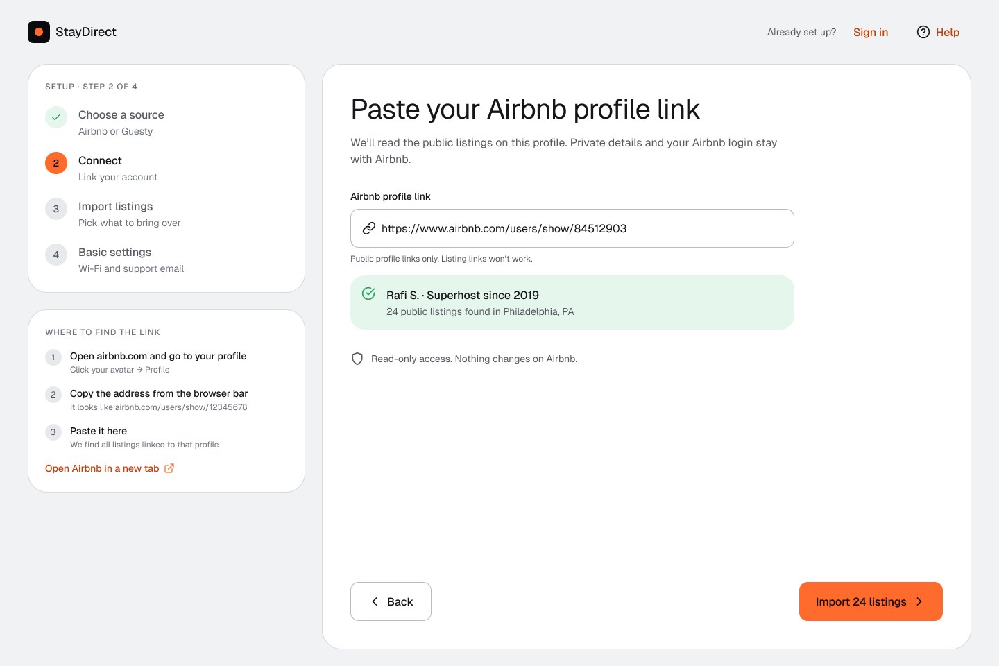
- Instant feedback. Pasting a profile link shows the found host and “24 listings” before the user presses anything.
- Everything selected by default. An 86-unit import is “deselect what you don’t want”, with search, filters and a disabled row for already-imported units.
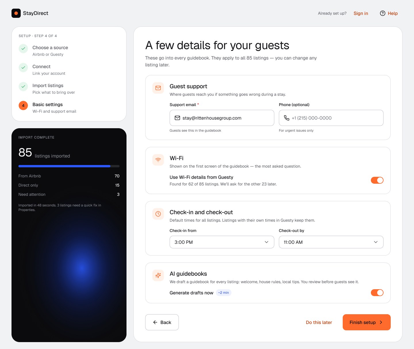
- Set once for all. Support email, Wi-Fi (pulled from Guesty) and check-in times apply to every listing. The shipped flow asked for them per listing.
- No dead ends. The import runs while the host fills in settings; the last screen gives three clear next steps.
2 Guest check-in: 6 steps to 4
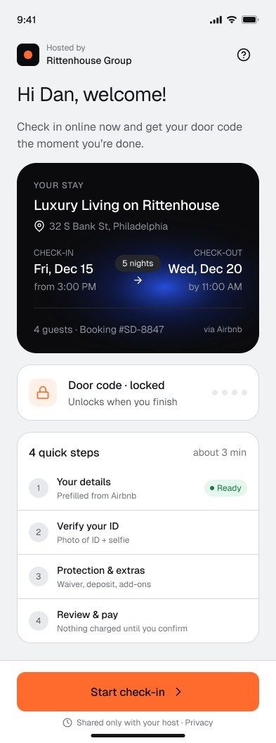
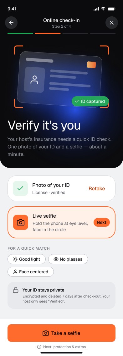
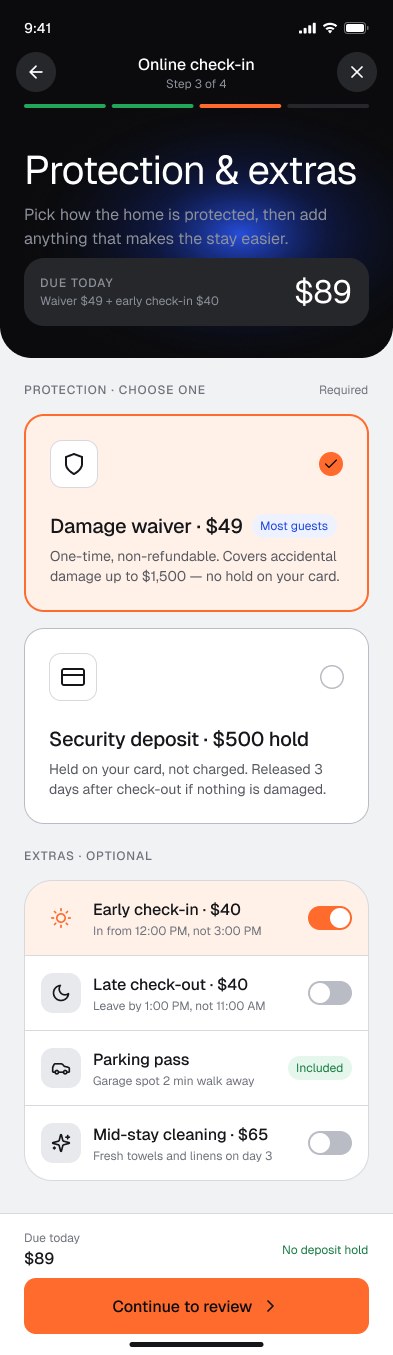
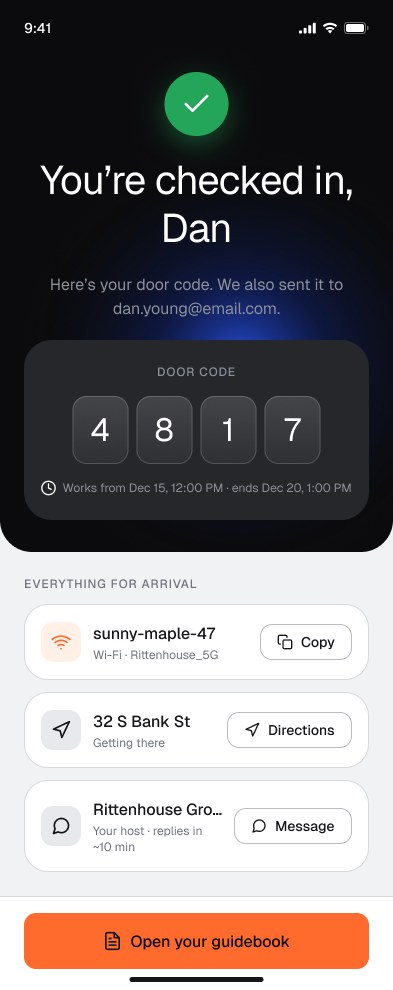
- Removed the survey step and prefilled details from the Airbnb booking.
- Clear money. Damage waiver ($49, one-time) or deposit ($500 hold, not charged) as two cards; the total updates live and is repeated next to the button.
- Fixed progress. Four segments that match four steps. The shipped flow showed 100% on step 5 of 6.
- A reason to finish. A locked door code on the welcome screen; it unlocks on the last screen together with Wi-Fi and directions.
- Trust at the right moment. “Your host only sees Verified” next to the ID step.
3 Guest Hub: a home screen that follows the stay
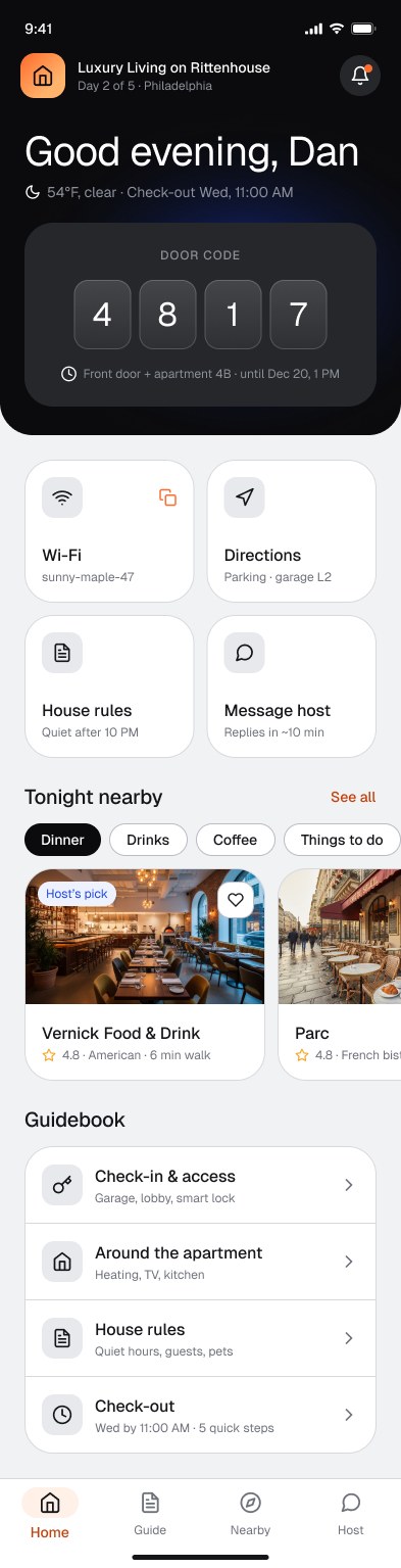
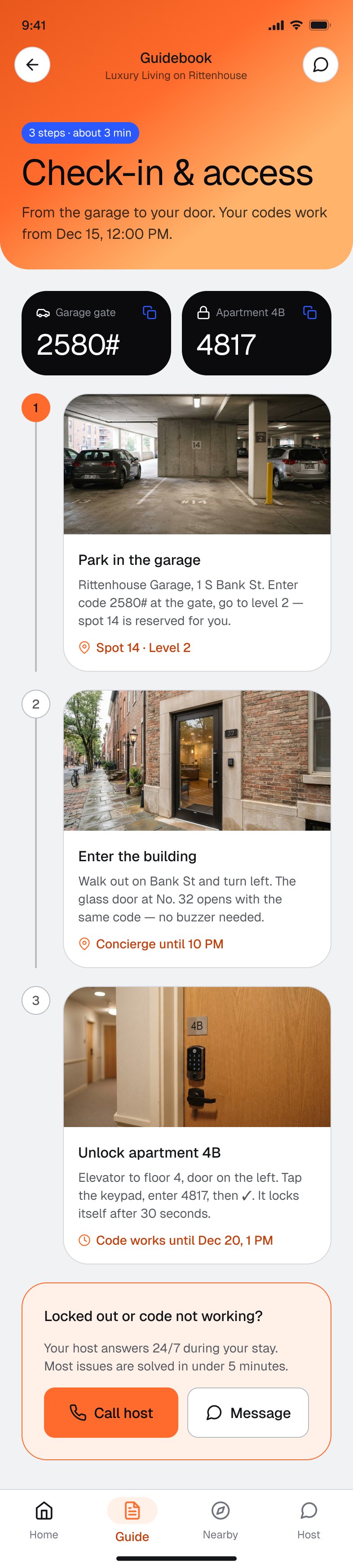
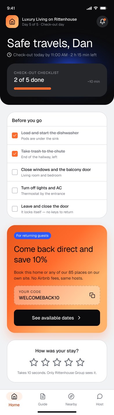
- Door code and Wi-Fi first, the two things guests search for most.
- The screen changes with the trip: during the stay, tips and guidebook; on check-out day, a checklist and the rebooking offer.
- The business moment. “Come back direct and save 10%” appears on check-out day, with a code to copy.
4 Booking page builder
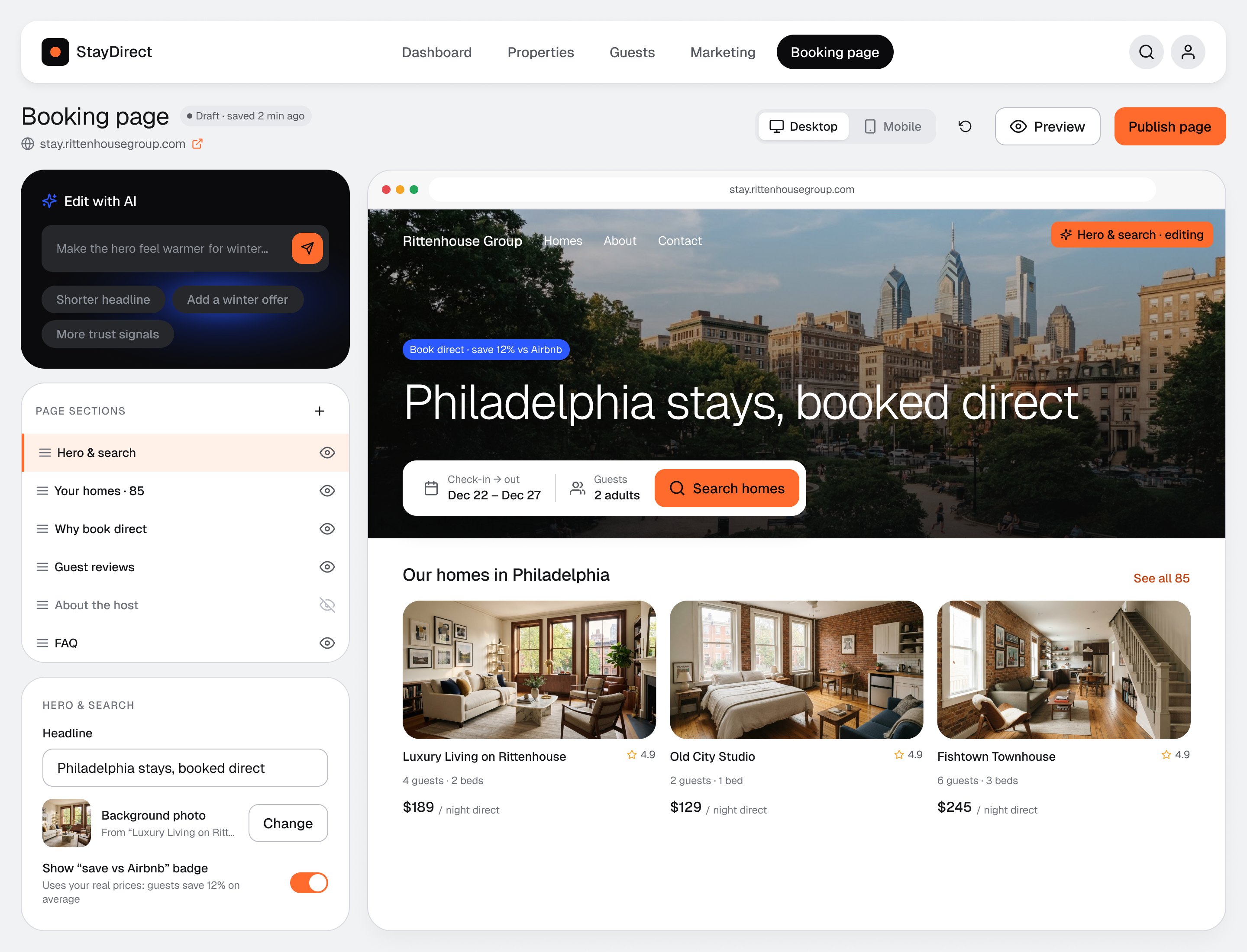
- Edit and preview side by side; the section being edited is marked in the live preview.
- AI as a helper, not the only way. Suggestion chips fill the blank prompt; manual settings stay one click away.
- A real reason to book direct. The “save vs Airbnb” badge is calculated from the host’s own prices.
5 Email marketing dashboard
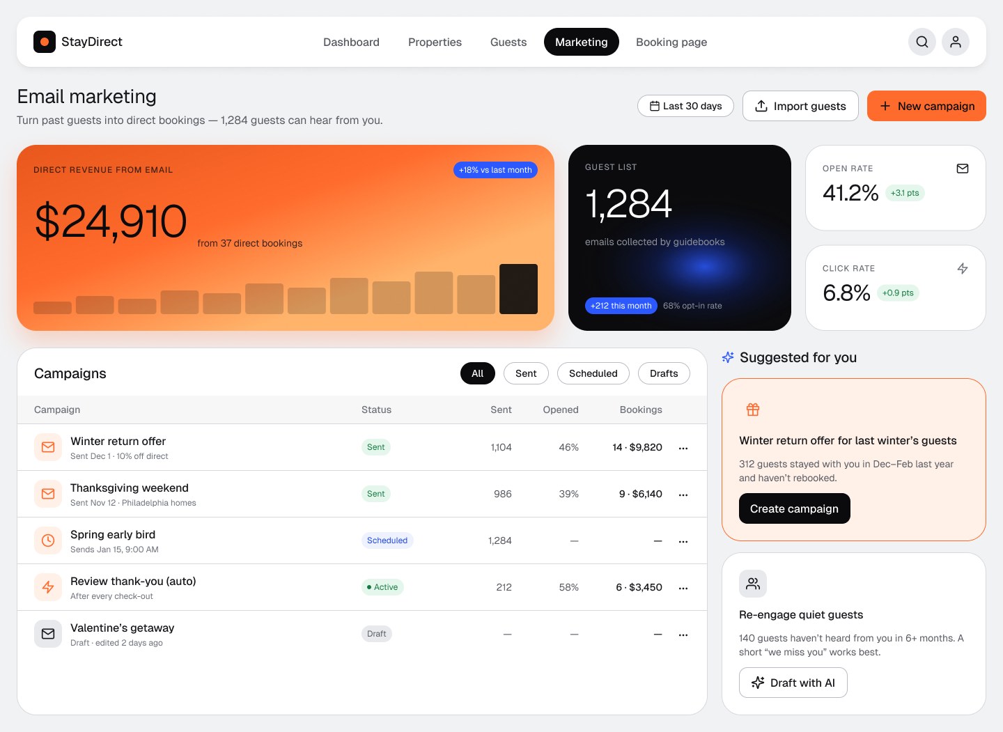
- Money first. Direct revenue from email is the hero number; bookings and revenue sit in every campaign row.
- Data-based suggestions (“312 guests stayed last winter”) instead of an empty “create campaign”.
- Safe actions. Delete moved from a red button in each row into a “…” menu.
06
Final UI
18 screens across both sides of the loop, all built from the v2 library.
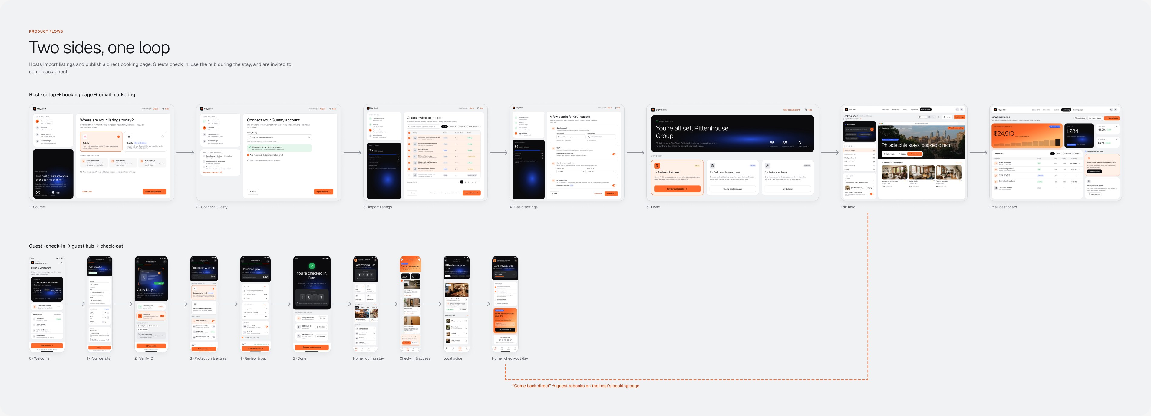
Host onboarding
Guest side
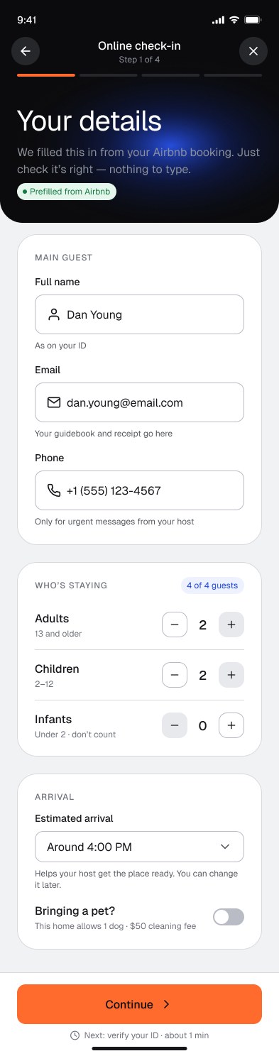
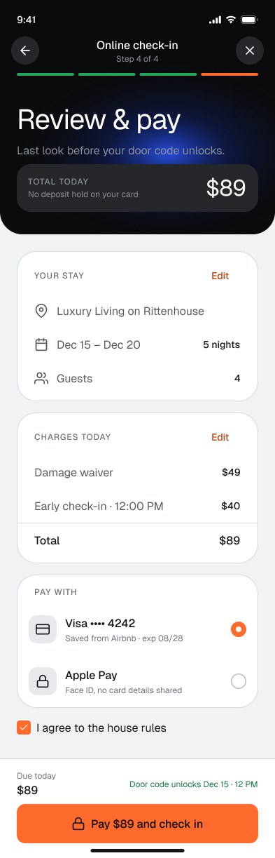
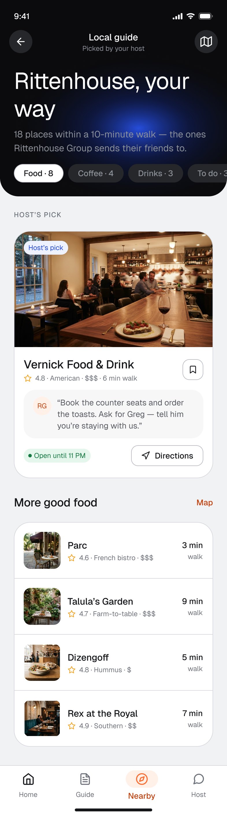
States covered: selected and default option cards, found profile, rows needing attention and already imported, disabled limits on guest steppers, locked and unlocked door code, done and to-do checklist items.
07
Outcome & learnings
What I achieved
- Took the product from first screens to an MVP launch in 2026 as the only designer, across a host web app and a guest mobile web app.
- Built the design system (v1) the product was designed on, then rebuilt it as v2: 50+ documented components, scoped tokens with CSS names, AA contrast by default.
- Five flows re-designed around the real customer, a host with dozens of units: onboarding from 7 screens to 4 steps, guest check-in from 6 steps to 4.
- A clear product loop on one board: guidebook → guest emails → campaign → direct booking.
What changed after release
Faster onboarding, less friction
After my onboarding and check-in updates shipped, the founder reported that users noticed the changes and reacted positively: onboarding took less time and there was less friction along the way.
Faster to build
The developers said the design system made their work faster: ready components and tokens instead of building every screen from scratch.
This is qualitative feedback from the team. Exact numbers are under NDA.
How I would measure success
Product data is under NDA and the re-created flows were not tested in this form, so these are the targets I would set for the next round, not results.
| Metric | Why it matters | Target |
|---|---|---|
| Check-in completed before arrival | The guest’s first task; it unlocks the door code | 85%+ of guests |
| Time to finish check-in | Shows if 4 steps really feel quick | Under 3 minutes |
| Time to import and set up 20+ listings | Setup that scales for Lisa | Under 10 minutes |
| Guests who leave an email in the guidebook | Fuels every campaign | Baseline first, then grow |
| Direct bookings from past guests | The reason the product exists | Baseline first, then grow |
No research is not a reason to skip it
Proto-personas, CJMs and an audit made every decision traceable, even as hypotheses.
A system grows best next to real screens
Each flow added components; each component made the next flow faster.
Trust is a UI problem too
Clear money, one visual language and honest copy matter most where a guest pays outside Airbnb.
Being the only designer
Four years alone on a product taught me to document decisions, because nobody else would remember why a screen looks the way it does.
What I would test first: the check-in flow with 5 guests (time to finish, drop-off per step) and the import step with 3 property managers, to see if the targets above are realistic.