01
Context & my role
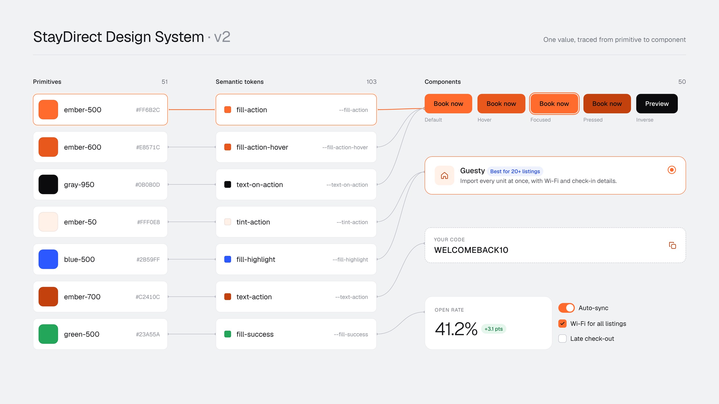
This is the design system behind the StayDirect case, where the product, my role and the NDA are explained. I built v1 while working on the product. For the portfolio I rebuilt it as v2 before re-creating any screen, and grew it together with the screens.
This case is only about the system: how I audited v1, the rules I added in v2, and the scripted checks that keep it honest.
02
Problem
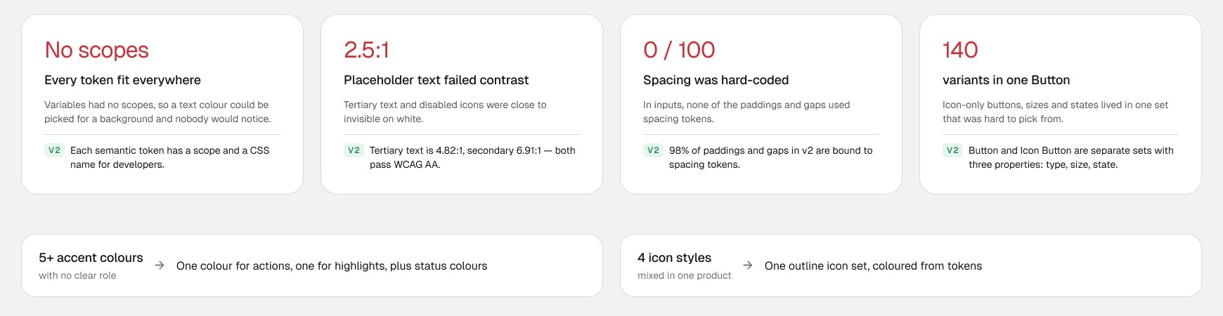
v1 had the right structure, with primitive and semantic tokens and documented components, but loose rules. A system with loose rules looks consistent in the library and drifts in the product.
For a product that asks guests to pay outside Airbnb, visual inconsistency is not cosmetic: it lowers trust at the moment of payment.
03
Process
Audit v1
Listed what to keep (two token layers, component docs) and what to fix (above).
Direction
Picked four references for the new style (dark hero cards, light large numbers, pill tabs, airy bento layouts) and turned them into one style tile.
Foundations
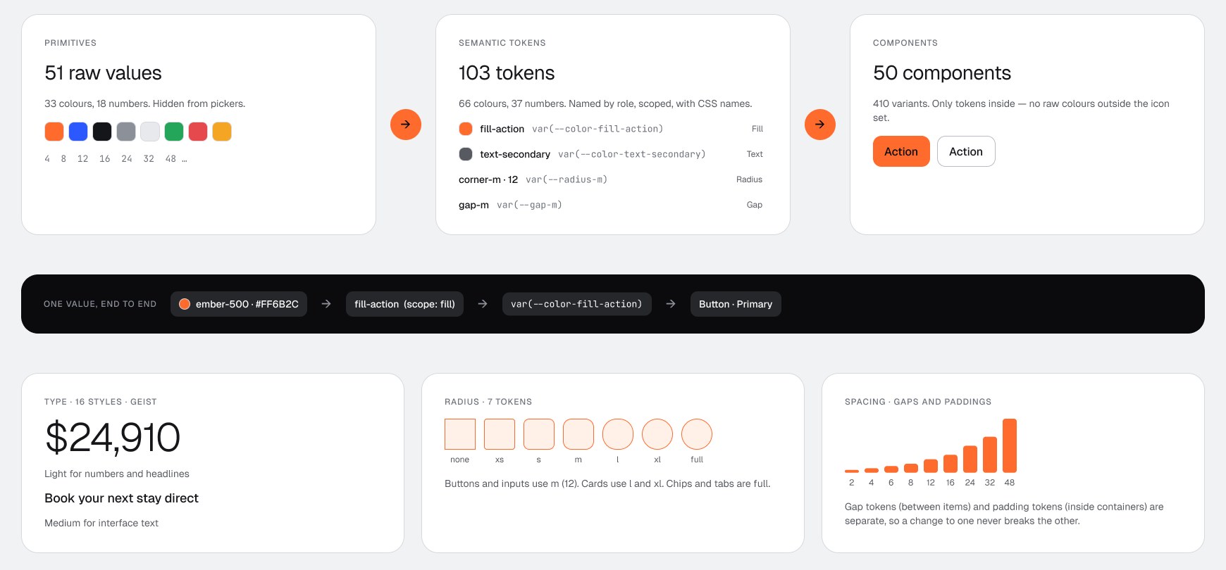
4 variable collections: primitives (33 colours, 18 numbers) hidden from pickers, and semantic tokens (66 colours, 37 numbers) named by role, scoped, with CSS names. Geist for all type, 16 text styles. Radius and spacing scales as tokens; gaps and paddings are separate sets.
Component recipe
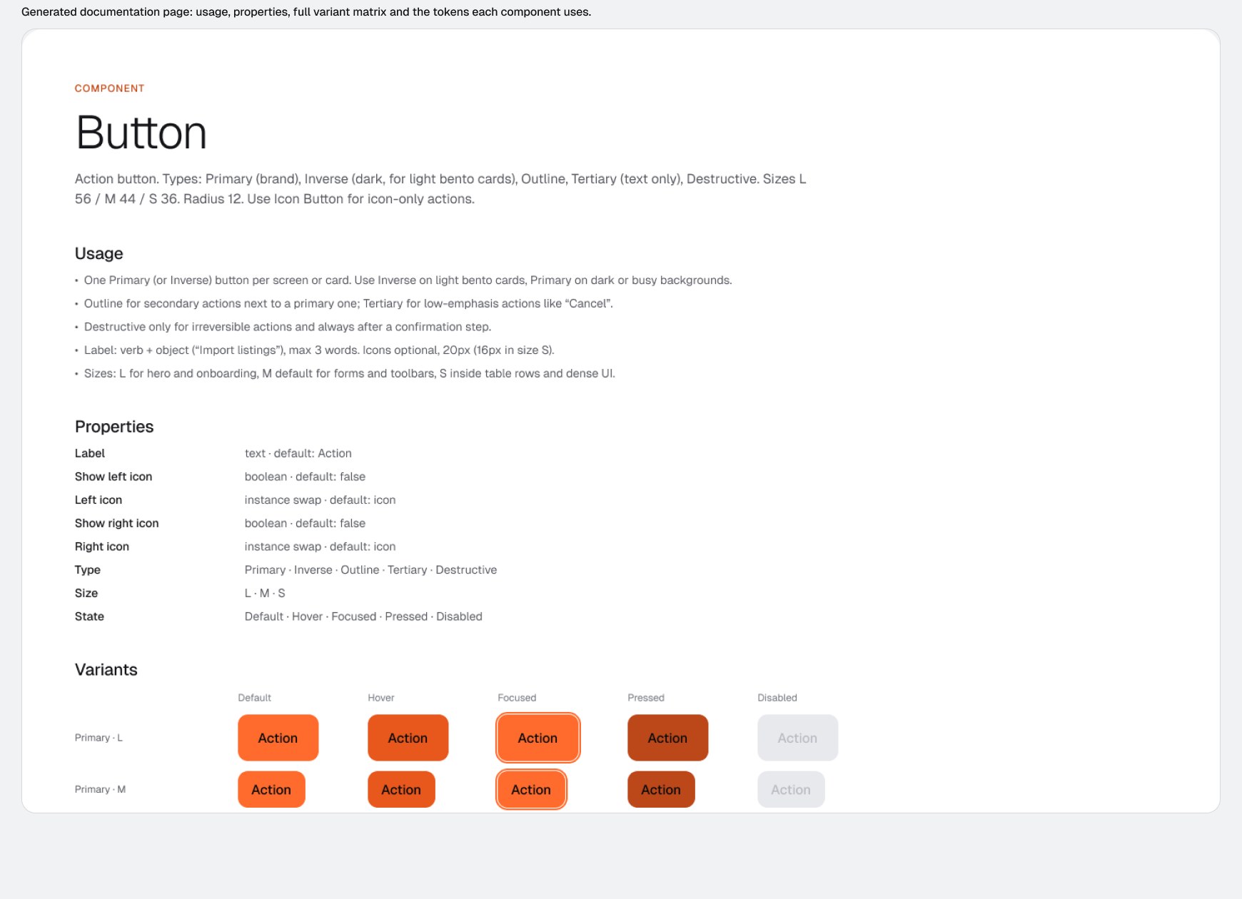
Variant properties only for what changes the look; booleans and instance swaps for content; hover, focus and pressed from overlay tokens; a documentation page with usage, properties, the full variant matrix and the tokens it uses.
Grow with the flows
The library was not finished before the screens. Each flow added what it needed and documented it before its screens were rebuilt on it (v2.0 → v2.5).
Audit again
A scripted quality pass on the whole library (v2.6, below).
04
Key decisions
1 Ember is the only action colour, with dark text
- Decided
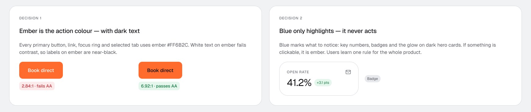
- Every primary button, link, focus ring and selected tab uses ember #FF6B2C, and labels on ember are near-black.
- Why
- White text on ember is 2.84:1 and fails WCAG AA; near-black is 6.92:1. One clickable colour is also one rule users learn once.
- Rejected
- White-on-orange buttons (the common default) and a second brand colour for actions.
2 Blue only highlights
- Decided
- Blue marks what to notice (key numbers, badges, the glow on dark hero cards) and is never clickable.
- Why
- In v1, five accents competed for attention. Splitting “act” and “notice” into two colours made screens easier to scan.
3 Components can only see semantic tokens
- Decided
- Primitives are hidden from pickers; components use scoped semantic tokens with CSS names.
- Why
- A scope stops mistakes at the moment of picking, and the CSS name gives developers the same word the designer used.
- Rejected
- One flat token list: simpler on day one, impossible to change later.
4 Separate Button and Icon Button
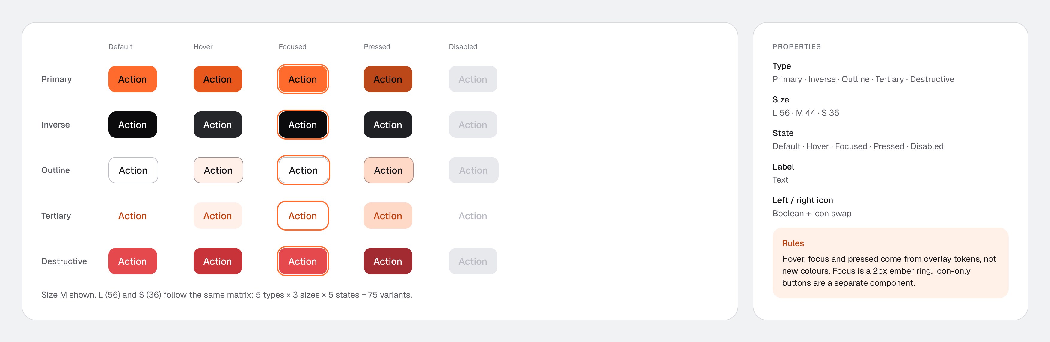
- Decided
- Two components with the same three properties (type, size, state) instead of one 140-variant set.
- Why
- Fewer properties per set make the right variant easy to find; both stay in sync through shared tokens.
See the generated documentation page
5 Build the library next to the screens
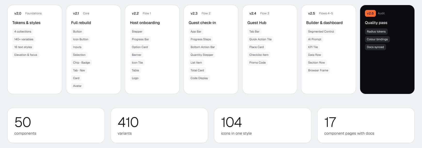
- Decided
- Each flow adds its components, documented, before its screens are rebuilt on them.
- Why
- Components designed in a vacuum miss real content and real states. Components pulled from real screens get used.
- Rejected
- Finishing the full library before starting the flows.
05
Quality checks
I ran scripted audits on every component through the Figma Plugin API, with an AI assistant writing and running the scripts. Each check answers one question: does this component really use the system, or does it only look like it does?
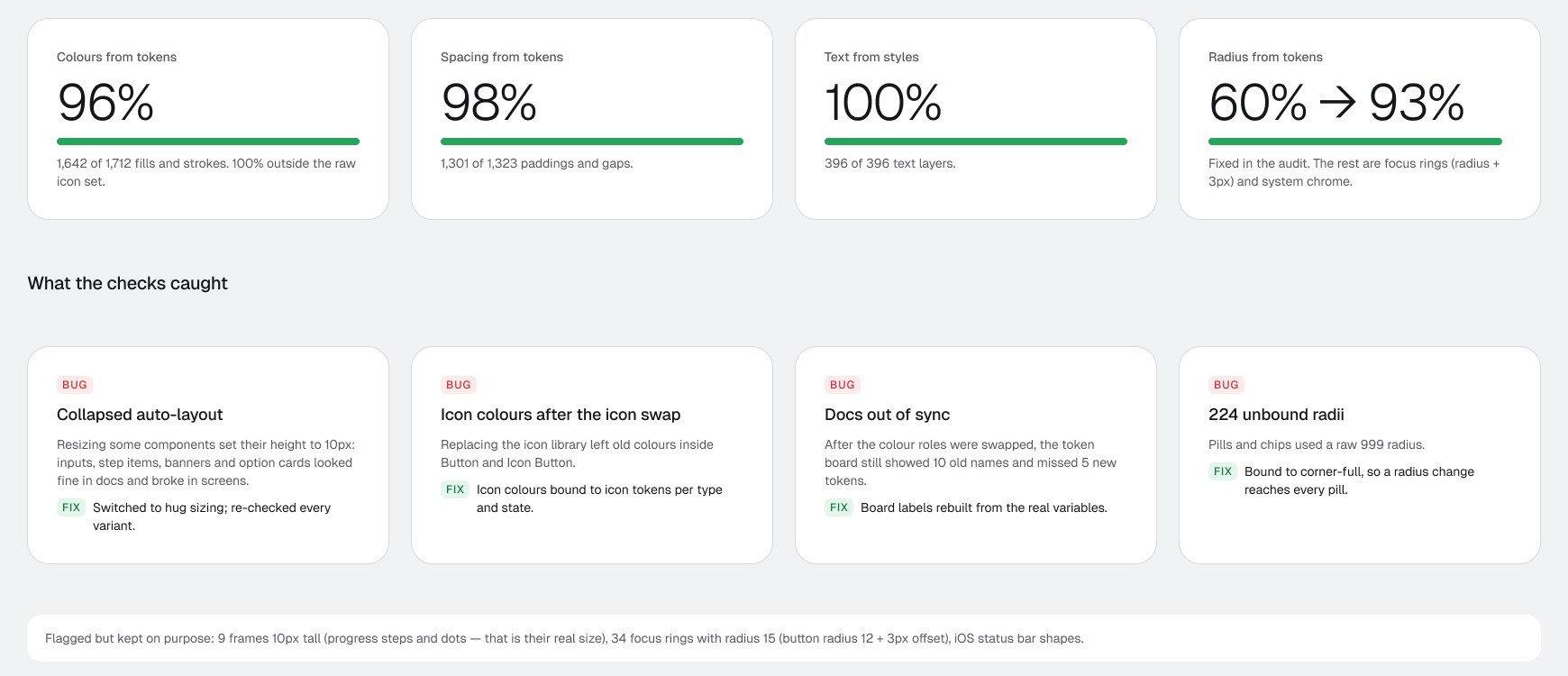
- Collapsed auto-layout. Some components collapsed to 10px when resized. They looked fine on the docs page and broke in screens. Fixed with hug sizing and a re-check of every variant.
- Icon colours after the icon swap. Replacing the icon library left old colours inside Button and Icon Button. Fixed by binding icon colours to icon tokens per type and state.
- Docs out of sync. The token board still showed 10 old names and missed 5 new tokens. Labels are now rebuilt from the real variables.
- 224 raw radii. Pills and chips used a raw 999 radius. Now bound to corner-full.
06
Outcome & learnings
What exists now: a published Figma library with 50 documented components, 154 variables (51 primitives, 103 scoped semantic tokens with CSS names), and 18 re-created screens built only from it. The product team has not adopted v2 yet, so I don’t claim delivery-speed or consistency metrics from production.
Rules matter more than parts
v1 had most of the parts. What it lacked were rules that stop mistakes: scopes, one action colour, contrast by default.
A system grows best next to real screens
Each flow added components; each component made the next flow faster.
Audit the system like a product
A library can look perfect on its docs page and still be full of hard-coded values. Scripted checks found bugs I would never see by eye.
What I would do from day one
Set scopes when creating each variable, keep gaps and paddings as separate sets, and run the audit after every release.